
User Guide


414 DateChooser component (Flash Professional only)
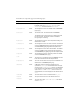
A DateChooser component supports the following styles:
Style Theme Description
themeColor
Halo The glow color for the rollover and selected dates.
Possible values are
"haloGreen", "haloBlue", and
"haloOrange". The default value is "haloGreen".
backgroundColor
Both The background color. The default value is 0xEFEBEF
(light gray).
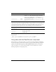
borderColor
Both The border color. The default value is 0x919999.
The DateChooser component uses a solid single-pixel
line as its border. This border cannot be modified
through styles or skinning.
headerColor
Both The background color for the component heading. The
default color is white.
rollOverColor
Both The background color of a rolled-over date. The default
value is 0xE3FFD6 (bright green) with the Halo theme
and 0xAAAAAA (light gray) with the Sample theme.
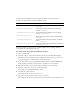
selectionColor
Both The background color of the selected date. The default
value is 0xCDFFC1 (light green) with the Halo theme
and 0xEEEEEE (very light gray) with the Sample theme.
todayColor
Both The background color for the today’s date. The default
value is 0x666666 (dark gray).
color
Both The text color. The default value is 0x0B333C with the
Halo theme and blank with the Sample theme.
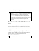
disabledColor
Both The color for text when the component is disabled. The
default color is 0x848384 (dark gray).
embedFonts
Both A Boolean value that indicates whether the font
specified in
fontFamily is an embedded font. This style
must be set to
true if fontFamily refers to an embedded
font. Otherwise, the embedded font is not used. If this
style is set to
true and fontFamily does not refer to an
embedded font, no text is displayed. The default value is
false.
fontFamily
Both The font name for text. The default value is "_sans".
fontSize
Both The point size for the font. The default value is 10.
fontStyle
Both The font style: either "normal" or "italic". The default
value is
"normal".