
User Guide

260 DataGrid component (Flash Professional only)
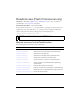
Setting styles for an individual column
Color and text styles can be set for the grid as a whole or for a column. You can use the
following syntax to set a style for a particular column:
grid.getColumnAt(3).setStyle("backgroundColor", 0xFF00AA);
Setting header styles
You can set header styles through headerStyle, which is a style property itself. To do this,
you create an instance of
CSSStyleDeclaration, set the appropriate properties on that
instance for the header, and then assign the
CSSStyleDeclaration to the headerStyle
property, as shown in the following example.
import mx.styles.CSSStyleDeclaration;
var headerStyles = new CSSStyleDeclaration();
headerStyles.setStyle("fontStyle", "italic");
grid.setStyle("headerStyle", headerStyles);
fontWeight
Both The font weight: either "none" or "bold". The default
value is
"none". All components can also accept the
value
"normal" in place of "none" during a setStyle()
call, but subsequent calls to
getStyle() return "none".
textAlign
Both The text alignment: either "left", "right", or "center".
The default value is
"left".
textDecoration
Both The text decoration: either "none" or "underline". The
default value is
"none".
vGridLines
Both A Boolean value that indicates whether to show
vertical grid lines (
true) or not (false). The default
value is
true.
hGridLines
Both A Boolean value that indicates whether to show
horizontal grid lines (
true) or not (false). The default
value is
false.
vGridLineColor
Both The color of the vertical grid lines. The default value is
0x666666 (medium gray).
hGridLineColor
Both The color of the horizontal grid lines. The default value
is 0x666666 (medium gray).
Style Theme Description