
User Guide

1470 Window component
Text styles can be set on the Window component itself, or they can be set on the
_global.styles.windowStyles class style declaration (text styles, only, not other styles like
themeColor or backgroundColor, which come from the
_global.styles.Window class style
declaration). This has the advantage of not causing style settings to propagate to child
components through style inheritance.
The following example demonstrates how to italicize the title of a Window component
without having this setting propagate to child components.
import mx.containers.Window;
_global.styles.windowStyles.setStyle("fontStyle", "italic");
createClassObject(Window, "window", 1, {title: "A Window"});
Notice that this example sets the property before instantiating the window through
createClassObject(). For the styles to take effect, they must be set before the window
is created.
Using skins with the Window component
The Window component uses skins for its title background and close button, and a
RectBorder instance for the border. The Window skins are found in the Flash UI
Components 2/Themes/ MMDefault/Window Assets folder in each of the theme files. For
more information about skinning, see “About skinning components” in Using Components.
For more information about the RectBorder class and using it to customize borders, see
“RectBorder class” on page 1063.
The title background skin is always displayed. The height of the background is determined by
the skin graphics. The width of the skin is set by the Window component according to the
Window instance’s size. The close skins are displayed when the
closeButton property is set
to
true and when a change state results from user interaction.
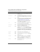
A Window component uses the following skin properties:
textDecoration
Both The text decoration: either "none" or "underline". The
default value is
"none".
textIndent
Both A number indicating the text indent. The default value is
0.
Property Description
skinTitleBackground
The title bar. The default value is TitleBackground.
skinCloseUp
The close button. The default value is CloseButtonUp.
Style Theme Description