
User Guide

1394 UIScrollBar Component
Using skins with the UIScrollBar component
The UIScrollBar component uses 13 skins for the track, scroll box (thumb), and buttons. To
customize these skin elements, edit the symbols in the Flash UI Components 2/Themes/
MMDefault/ScrollBar Assets/States folder. For more information, see “About skinning
components” in Using Components.
Both horizontal and vertical scroll bars use the same vertical skins, and when displaying a
horizontal scroll bar the UIScrollBar component rotates the skins as appropriate.
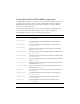
The UIScrollBar component supports the following skin properties.
Property Description
upArrowUpName
The up (normal) state of the up and left buttons. The default value is
ScrollUpArrowUp.
upArrowOverName
The rollover state of the up and left buttons. The default value is
ScrollUpArrowOver.
upArrowDownName
The pressed state of the up and left buttons. The default value is
ScrollUpArrowDown.
downArrowUpName
The up (normal) state of the down and right buttons. The default
value is
ScrollDownArrowUp.
downArrowOverName
The rollover state of the down and right buttons. The default value is
ScrollDownArrowOver.
downArrowDownName
The pressed state of the down and right buttons. The default value is
ScrollDownArrowDown.
scrollTrackName
The symbol used for the scroll bar’s track (background). The default
value is
ScrollTrack.
scrollTrackOverName
The symbol used for the scroll track (background) when rolled over.
The default value is
undefined.
scrollTrackDownName
The symbol used for the scroll track (background) when pressed.
The default value is
undefined.
thumbTopName
The top and left caps of the scroll box (thumb). The default value is
ScrollThumbTopUp.
thumbMiddleName
The middle (expandable) part of the thumb. The default value is
ScrollThumbMiddleUp.
thumbBottomName
The bottom and right caps of the thumb. The default value is
ScrollThumbBottomUp.
thumbGripName
The grip displayed in front of the thumb. The default value is
ScrollThumbGripUp.