
User Guide

Customizing the UIScrollBar component 1393
Customizing the UIScrollBar component
You can transform a UIScrollBar component horizontally and vertically while authoring and
at runtime. However, a vertical UIScrollBar does not allow you to modify the width, and a
horizontal UIScrollBar does not allow you to modify the height. While authoring, select the
component on the Stage and use the Free Transform tool or any of the Modify > Transform
commands. At runtime, use the
setSize() method (see UIObject.setSize()) or any
applicable properties and methods of the UIScrollBar class.
Note, however, that with the Halo theme, the width of a vertically oriented scroll bar must be
16 pixels, and the height of a horizontally oriented scroll bar must also be 16 pixels. These
dimensions are determined strictly by the current theme used with the scroll bar. Only the
dimension of a scroll bar that corresponds to its length can be changed.
You can customize the appearance of a UIScrollBar instance by using styles and skins.
Using styles with the UIScrollBar component
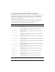
The UIScrollBar component supports the following styles:
NOTE
If you use the UIObject.setSize() method, you can change only the height or the
width of the instance, depending on whether the instance is a horizontal or a vertical
scroll bar. Therefore the setSize() method ignores either the height or the width
parameter.
Style Theme Description
themeColor
Halo The base color scheme of a component. Possible values
are
"haloGreen", "haloBlue", and "haloOrange". The
default value is
"haloGreen".
scrollTrackColor
Sample The background color for the scroll track.The default
value is 0xCCCCCC (light gray).
symbolColor
Sample The color of the up and down scroll arrows. The default
value is 0x000000 (black).
symbolDisabledColor
Sample The color of the up and down scroll arrows in a disabled
scroll bar. The default value is 0x848384 (dark gray).