
User Guide

129
6
CHAPTER 6
CheckBox component
A check box is a square box that can be selected or deselected. When it is selected, a check
mark appears in the box. You can add a text label to a check box and place it to the left, right,
top, or bottom.
A check box can be enabled or disabled in an application. If a check box is enabled and a user
clicks it or its label, the check box receives input focus and displays its pressed appearance. If a
user moves the pointer outside the bounding area of a check box or its label while pressing the
mouse button, the component’s appearance returns to its original state and it retains input
focus. The state of a check box does not change until the mouse is released over the
component. Additionally, the check box has two disabled states, selected and deselected,
which do not allow mouse or keyboard interaction.
If a check box is disabled, it displays its disabled appearance, regardless of user interaction. In
the disabled state, a button doesn’t receive mouse or keyboard input.
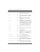
A CheckBox instance receives focus if a user clicks it or tabs to it. When a CheckBox instance
has focus, you can use the following keys to control it:
For more information about controlling focus, see “FocusManager class” on page 721 or
“Creating custom focus navigation” in Using Components.
A live preview of each CheckBox instance reflects changes made to parameters in the Property
inspector or Component inspector during authoring.
When you add the CheckBox component to an application, you can use the Accessibility
panel to make it accessible to screen readers. First, you must add the following line of code to
enable accessibility:
mx.accessibility.CheckBoxAccImpl.enableAccessibility();
Key Description
Shift+Tab Moves focus to the previous element.
Spacebar Selects or deselects the component and triggers the
click event.
Tab Moves focus to the next element.