
User Guide

1274 Tree component (Flash Professional only)
Using styles with the Tree component
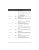
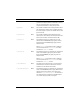
A Tree component uses the following styles:
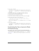
Style Theme Description
themeColor
Halo The base color scheme of a component. Possible
values are
"haloGreen", "haloBlue", and
"haloOrange". The default value is "haloGreen".
backgroundColor
Both The background color of the list. The default color is
white and is defined on the class style declaration.
This style is ignored if
alternatingRowColors is
specified.
backgroundDisabledColor
Both The background color when the component’s
enabled property is set to "false". The default value is
0xDDDDDD (medium gray).
depthColors
Both Sets the background colors for rows based on the
depth of each node. The value is an array of colors
where the first element is the background color for
the root node, the second element is the background
color for its children, and so on, continuing through
the number of colors provided in the array. This style
property is not set by default.
borderStyle
Both The Tree component uses a RectBorder instance as
its border and responds to the styles defined on that
class. See “RectBorder class” on page 1063.
The default border style is
"inset".
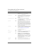
color
Both The text color.
disabledColor
Both The color for text when the component is disabled.
The default color is 0x848384 (dark gray).
embedFonts
Both A Boolean value that indicates whether the font
specified in
fontFamily is an embedded font. This
style must be set to
true if fontFamily refers to an
embedded font. Otherwise, the embedded font is not
used. If this style is set to
true and fontFamily does
not refer to an embedded font, no text is displayed.
The default value is
false.
fontFamily
Both The font name for text. The default value is "_sans".
fontSize
Both The point size for the font. The default value is 10.