
User Guide


1212 TextInput component
Customizing the TextInput component
You can transform a TextInput component horizontally while authoring and at runtime.
While authoring, select the component on the Stage and use the Free Transform tool or any of
the Modify > Transform commands. At runtime, use
UIObject.setSize() or any applicable
properties and methods of the Tex t In pu t cla s s.
When a TextInput component is resized, the border is resized to the new bounding box. The
TextInput component doesn’t use scroll bars, but the insertion point scrolls automatically as
the user interacts with the text. The text field is then resized within the remaining area; there
are no fixed-size elements in a TextInput component. If the TextInput component is too small
to display the text, the text is clipped.
Using styles with the TextInput component
The TextInput component has its backgroundColor and borderStyle style properties
defined on a class style declaration. Class styles override global styles; therefore, if you want to
set the
backgroundColor and borderStyle style properties, you must create a different
custom style declaration or define it on the instance.
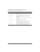
A TextInput component supports the following styles:
Style Theme Description
backgroundColor
Both The background color. The default color is white.
borderStyle
Both The TextInput component uses a RectBorder instance
as its border and responds to the styles defined on that
class. See “RectBorder class” on page 1063.
The default border style is
"inset".
marginLeft
Both A number indicating the left margin for text. The default
value is 0.
marginRight
Both A number indicating the right margin for text. The default
value is 0.
color
Both The text color. The default value is 0x0B333C for the
Halo theme and blank for the Sample theme.
disabledColor
Both The color for text when the component is disabled. The
default color is 0x848384 (dark gray).