
User Guide


1093
40
CHAPTER 40
ScrollPane component
The ScrollPane component displays movie clips, JPEG files, and SWF files in a scrollable area.
By using a scroll pane, you can limit the amount of screen area occupied by these media types.
The scroll pane can display content that is loaded from a local disk or from the Internet. You
can set this content while authoring and at runtime by using ActionScript.
Once the scroll pane has focus, if its content has valid tab stops, those markers receive focus.
After the last tab stop in the content, focus shifts to the next component. The vertical and
horizontal scroll bars in the scroll pane never receive focus.
A ScrollPane instance receives focus if a user clicks it or tabs to it. When a ScrollPane instance
has focus, you can use the following keys to control it:
For more information about controlling focus, see “FocusManager class” on page 721 or
“Creating custom focus navigation” in Using Components.
A live preview of each ScrollPane instance reflects changes made to parameters in the Property
inspector or Component inspector during authoring.
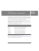
Key Description
Down Arrow Content moves up one vertical line scroll.
End Content moves to the bottom of the scroll pane.
Left Arrow Content moves right one horizontal line scroll.
Home Content moves to the top of the scroll pane.
Page Down Content moves up one vertical page scroll.
Page Up Content moves down one vertical page scroll.
Right Arrow Content moves left one horizontal line scroll.
Up Arrow Content moves down one vertical line scroll.