
User Guide

1023
35
CHAPTER 35
RadioButton component
The RadioButton component lets you force a user to make a single choice within a set of
choices. This component must be used in a group of at least two RadioButton instances. Only
one member of the group can be selected at any given time. Selecting one radio button in a
group deselects the currently selected radio button in the group. You set the
groupName
parameter to indicate which group a radio button belongs to.
A radio button can be enabled or disabled. A disabled radio button doesn’t receive mouse or
keyboard input. When the user clicks or tabs into a RadioButton component group, only the
selected radio button receives focus. The user can then use the following keys control it:
For more information about controlling focus, see “FocusManager class” on page 721 or
“Creating custom focus navigation” in Using Components.
A live preview of each RadioButton instance on the Stage reflects changes made to parameters
in the Property inspector or Component inspector during authoring. However, the mutual
exclusion of selection does not display in the live preview. If you set the selected parameter to
true for two radio buttons in the same group, they both appear selected even though only the
last instance created appears selected at runtime. For more information, see “RadioButton
parameters” on page 1024.
When you add the RadioButton component to an application, you can use the Accessibility
panel to make it accessible to screen readers. First, you must add the following line of code to
enable accessibility:
mx.accessibility.RadioButtonAccImpl.enableAccessibility();
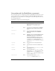
Key Description
Up Arrow/Left
Arrow
The selection moves to the previous radio button within the radio
button group.
Down Arrow/
Right Arrow
The selection moves to the next radio button within the radio button group.
Tab Moves focus from the radio button group to the next component.