
User Guide


Using custom UI controls in extensions 61
Creating a tree control
The
MM:TREECONTROL tag creates a tree control and can use one or more tags to add structure, as
described in the following list:
• MM:TREECOLUMN is an empty, optional tag that defines a column in the tree control.
• MM:TREENODE is an optional tag that defines a node in the tree. It is a nonempty tag that can
contain only other
MM:TREENODE tags.
MM:TREECONTROL tags have the following attributes:
MM:TREECOLUMN tags have the following attributes:
For readability,
TREECOLUMN tags should follow immediately after the MM:TreeControl tag, as
shown in the following example:
<MM:TREECONTROL name="tree1">
<MM:TREECOLUMN name="Column1" width="100" state="visible">
<MM:TREECOLUMN name="Column2" width="80" state="visible">
...
</MM:TREECONTROL>
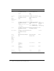
Attribute name Description
name
Name of the tree control
size
Optional. Number of rows that show in the control; default is 5 rows
theControl
Optional. If the number of nodes in the theControl attribute exceeds the
value of the size attribute, scrollbars appear
multiple
Optional. Allows multiple selections; default is single-selection
style
Optional. Style definition for height and width of tree control; if specified,
takes precedence over the
size attribute
noheaders
Optional. Specifies that the column headers should not appear
Attribute name Description
name
Name of the column
value
String to appear in column header
width
Width of the column in pixels (percentage not supported); default is 100
align
Optional. Specifies whether the text in the column should be aligned left,
right, or center; default is left
state
Specifies whether the column is visible or hidden