
Specifications


User Interfaces for Extensions 37
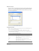
Adding a variable grid control
The variable grid control has the following attributes:
The following example adds a simple variable grid control to a dialog box:
<select name="ParamList" style="width:515px;" ¬
type="mmparameterlist columns"="Name,SQL Data ¬
Type,Direction,Default Value,Run-time Value" size=6></select>
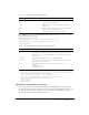
The following example creates a variable grid control that is 500 pixels wide, with five columns of
various widths:
<select name="ParamList" style="width:500px;" ¬
type=mmparameterlist columns="Name,SQL Data Type,Direction, ¬
Default Value,Run-time Value" columnWidth="100,25,11," size=6>¬
</select>
This example creates two blank columns that are 182 pixels wide. (The specified columns total
136. The total width of the control is 500. The remaining space after the first three columns have
been placed is 364. There are two columns left; 364 divided by 2 is 182.)
This grid control also has a JavaScript wrapper object that should be used to access and
manipulate the grid control’s data. You can find the implementation within the
GridControlClass.js file in the Configuration\Shared\MM\Scripts\Class folder.
Attribute Name Description
name Name of the variable grid control
style Width of the control, in pixels
type Type of control
columns Each column must have a name, separated by a comma
columnWidth Width of each column, each separated by a comma. If no widths are specified, the
columns are of equal width.