
User Guide

Tree component 227
Event summary for the TextInput class
Tree component
The Tree component allows a user to view hierarchical data. The tree appears within a box like the
List component, but each item in a tree is called a node and can be either a leaf or a branch. By
default, a leaf is represented by a text label beside a file icon and a branch is represented by a text
label beside a folder icon with a disclosure triangle that a user can open to expose children. The
children of a branch can either be leaves or branches themselves.
The data of a tree component must be provided from an XML data source. For more
information, see the next section.
When a Tree instance has focus either from clicking or tabbing, you can use the following keys to
control it:
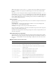
TextInput.maxChars
The maximum number of characters that a user can enter in a TextInput
text field.
TextInput.maxHPosition
The maximum possible value for TextField.hPosition. This property is
read-only.
TextInput.password
A Boolean value that indicates whether or not the input text field is a
password field that hides the entered characters.
TextInput.restrict
Indicates which characters a user can enter in a text field.
TextInput.text
Sets the text content of a TextInput text field.
Event Description
TextInput.change
Triggered when the Input field changes.
TextInput.enter
Triggered when the enter key is pressed.
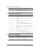
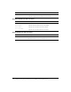
Key Description
Down arrow Moves selection down one.
Up arrow Moves selection up one.
Right arrow Opens a selected branch node. If a branch is already open, moves to first
child node.
Left arrow Closes a selected branch node. If on a leaf node of a closed branch node,
moves to parent node.
Space Opens or closes a selected branch node.
End Moves selection to the bottom of the list.
Home Moves selection to the top of the list.
Page Down Moves selection down one page.
Page Up Moves selection up one page.
Property Description