
User Guide

212 Chapter 9: Using Flash, Flash Components, and Other Interactive Media Types
A CheckBox component supports the following Halo styles:
Property summary for the CheckBox class
Event summary for the CheckBox class
DateChooser component
The DateChooser component is a calendar that allows users to select a date. It has buttons that
allow users to scroll through months and click on a date to select it. You can set parameters that
indicate the month and day names, the first day of the week, and any disabled dates, as well as
highlighting the current date.
The DateChooser can be used anywhere you want a user to select a date. For example, you could
use a DateChooser component in a hotel reservation system with certain dates selectable and
others disabled. You could also use the DateChooser component in an application that displays
current events, such as performances or meetings, when a user chooses a date.
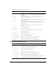
Style Description
themeColor
The background of a component. This is the only color style that doesn’t
inherit its value. Possible values are "haloGreen", "haloBlue", and
"haloOrange".
color
The text of a component label.
disabledColor
The disabled color for text.
fontFamily
The font name for text.
fontSize
The point size for the font.
fontStyle
The font style: either "normal", or "italic".
fontWeight
The font weight: either "normal", or "bold".
textDecoration
The text decoration: either "none", or "underline".
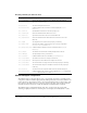
Property Description
CheckBox.label
Specifies the text that appears next to a check box.
CheckBox.labelPlacement
Specifies the orientation of the label text in relation to a check box.
CheckBox.selected
Specifies whether the check box is selected (true) or deselected (false).
Event Description
CheckBox.click
Triggered when the mouse is pressed over a button instance.