
User Guide

CheckBox component 211
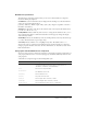
Property summary for the Button class
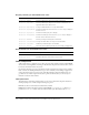
Event summary for the Button class
CheckBox component
A check box is a fundamental part of any form or web application. You can use check boxes
wherever you need to gather a set of
true or false values that aren’t mutually exclusive. For
example, a form collecting personal information about a customer could have a list of hobbies for
the customer to select; each hobby would have a check box beside it.
CheckBox parameters
The following are authoring parameters that you can set for each CheckBox component instance
in the Property inspector or in the Component Inspector panel:
label sets the value of the text on the check box; the default value is defaultValue.
selected sets the initial value of the check box to checked (true) or unchecked (false).
labelPlacement orients the label text on the check box. This parameter can be one of four
values: left, right, top, or bottom; the default value is right. For more information, see
CheckBox.labelPlacement.
You can write scripts to control these and additional options for CheckBox components using
its properties, methods, and events. For more information, see “CheckBox class” in the Flash
documentation.
Using styles with the CheckBox component
You can set style properties to change the appearance of a CheckBox instance. If the name of a
style property ends in “Color”, it is a color style property and behaves differently than non-color
style properties.
Method Description
Button.label
Specifies the text that appears within a button.
Button.labelPlacement
Specifies the orientation of the label text in relation to an icon.
Button.selected
When the toggle property is true, specifies whether the button is pressed
(
true) or not (false).
Button.toggle
Indicates whether the button behaves as a toggle switch.
Method Description
Button.click
Broadcast when the mouse is pressed over a button instance or when the
Spacebar is pressed.