
User Guide

210 Chapter 9: Using Flash, Flash Components, and Other Interactive Media Types
Button component
The Button component is a resizable rectangular user interface button. You can add a custom
icon to a button. You can also change the behavior of a button from push to toggle. A toggle
button stays pressed when clicked and returns to its up state when clicked again.
A button can be enabled or disabled in an application. In the disabled state, a button doesn’t
receive mouse or keyboard input. An enabled button receives focus if you click it or tab to it.
Button parameters
The following are authoring parameters that you can set for each Button component instance in
the Property inspector or in the Component Inspector panel:
label sets the value of the text on the button; the default value is Button.
icon adds a custom icon to the button. The value is the linkage identifier of a movie clip or
graphic symbol in the library; there is no default value.
toggle turns the button into a toggle switch. If true, the button remains in the down state when
pressed and returns to the up state when pressed again. If false
, the button behaves like a normal
push button; the default value is false.
selected if the toggle parameter is true, this parameter specifies whether the button is pressed
(true) or released (false). The default value is false.
labelPlacement orients the label text on the button in relation to the icon. This parameter can be
one of four values: left, right, top, or bottom; the default value is right. For more information, see
Button.labelPlacement.
You can write scripts to control these and additional options for Button components using
its properties, methods, and events. For more information, see “Button class” in the Flash
documentation.
Using styles with the Button component
You can set style properties to change the appearance of a button instance. If the name of a style
property ends in “Color”, it is a color style property and behaves differently than non-color
style properties.
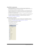
A Button component supports the following Halo styles:
Style Description
themeColor
The background of a component. This is the only color style that doesn’t
inherit its value. Possible values are "haloGreen", "haloBlue", and
"haloOrange".
color
The text of a component label.
disabledColor
The disabled color for text.
fontFamily
The font name for text.
fontSize
The point size for the font.
fontStyle
The font style: either "normal", or "italic".
fontWeight
The font weight: either "normal", or "bold".