
User Guide
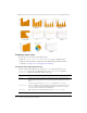
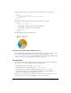
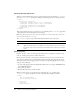
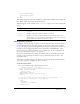
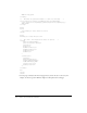
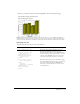
Table Of Contents
- Contents
- The CFML Programming Language
- Elements of CFML
- Using ColdFusion Variables
- Using Expressions and Number Signs
- Using Arrays and Structures
- Contents
- About arrays
- Basic array techniques
- Populating arrays with data
- Array functions
- About structures
- Creating and using structures
- Structure examples
- Structure functions
- Extending ColdFusion Pages with CFML Scripting
- Using Regular Expressions in Functions
- Building Blocks of ColdFusion Applications
- Creating ColdFusion Elements
- Writing and Calling User-Defined Functions
- Contents
- About user-defined functions
- Creating user-defined functions
- Calling user-defined functions
- Working with arguments and variables in functions
- Handling errors in UDFs
- A user-defined function example
- Using UDFs effectively
- Building and Using ColdFusion Components
- Contents
- About ColdFusion components
- Creating ColdFusion components
- Using ColdFusion components
- Passing parameters to methods
- CFC variables and scope
- Using CFCs effectively
- ColdFusion component example
- Creating and Using Custom CFML Tags
- Building Custom CFXAPI Tags
- Developing CFML Applications
- Designing and Optimizing a ColdFusion Application
- Contents
- About applications
- Elements of a ColdFusion application
- Structuring an application
- Defining the application and its event handlers in Application.cfc
- Migrating from Application.cfm to Application.cfc
- Using an Application.cfm page
- Optimizing ColdFusion applications
- Handling Errors
- Contents
- About error handling in ColdFusion
- Understanding errors
- Error messages and the standard error format
- Determining error-handling strategies
- Specifying custom error messages with the cferror tag
- Logging errors with the cflog tag
- Handling runtime exceptions with ColdFusion tags
- Using Persistent Data and Locking
- Contents
- About persistent scope variables
- Managing the client state
- Configuring and using client variables
- Configuring and using session variables
- Configuring and using application variables
- Using server variables
- Locking code with cflock
- Examples of cflock
- Securing Applications
- Contents
- ColdFusion security features
- About resource and sandbox security
- About user security
- Using ColdFusion security tags and functions
- Security scenarios
- Implementing user security
- Developing Globalized Applications
- Debugging and Troubleshooting Applications
- Contents
- Configuring debugging in the ColdFusion MX Administrator
- Using debugging information from browser pages
- Controlling debugging information in CFML
- Using the cftrace tag to trace execution
- Using the cftimer tag to time blocks of code
- Using the Code Compatibility Analyzer
- Troubleshooting common problems
- Designing and Optimizing a ColdFusion Application
- Accessing and Using Data
- Introduction to Databases and SQL
- Accessing and Retrieving Data
- Updating Your Database
- Using Query of Queries
- Contents
- About record sets
- About Query of Queries
- Query of Queries user guide
- Using dot notation
- Using joins
- Using unions
- Using conditional operators
- Managing data types for columns
- Using the CAST function
- Using aggregate functions
- Using group by and having expressions
- Using ORDER BY clauses
- Using aliases
- Handling null values
- Concatenating strings
- Escaping reserved keywords
- Using Queries of Queries with dates
- Understanding Query of Queries performance
- Understanding Query of Queries processing
- Managing LDAP Directories
- Building a Search Interface
- Contents
- About Verity
- Creating a search tool for ColdFusion applications
- Creating a search page
- Enhancing search results
- Working with data returned from a query
- Using Verity Search Expressions
- Requesting and Presenting Information
- Introduction to Retrieving and Formatting Data
- Building Dynamic Forms with cfform Tags
- Validating Data
- Contents
- About ColdFusion MX validation
- Validating form fields
- Handling invalid data
- Masking form input values
- Validating form data with regular expressions
- Validating form data using hidden fields
- Validating form input and handling errors with JavaScript
- Validating data with the IsValid function and the cfparam tag
- Creating Forms in Macromedia Flash
- Creating Skinnable XML Forms
- Creating Charts and Graphs
- Creating Reports for Printing
- Contents
- About printable output
- Creating PDF and FlashPaper output with the cfdocument tag
- Creating reports with the ColdFusion MX 7 reporting
- Reporting features
- Reporting architecture
- Getting started
- Basic steps for creating reports
- Report definition guidelines
- Common reporting tasks and techniques
- Grouping and group breaks
- Defining, modifying, and using fields and input parameters
- Using toolbox elements on report bands
- Aligning elements
- Using text styles
- Previewing reports
- Displaying page numbers
- Using layered controls
- Using links
- Using the Properties sheet
- Displaying reports
- Using input parameters to pass variables and other data at runtime
- Configuring RDS
- Using the Report Creation Wizard
- Using the Query Builder
- Using CFML in reports
- Using charts
- Using subreports
- Font management with printable reports
- Creating reports with Crystal Reports (Windows only)
- Using the Flash Remoting Service
- Using Server-Side ActionScript
- Contents
- About server-side ActionScript
- Connecting to the Flash Remoting service
- Using server-side ActionScript functions
- Global and request scope objects
- About the CF.query function and data sources
- Using the CF.query function
- Building a simple application
- About the CF.http function
- Using the CF.http function
- Using Web Elements and External Objects
- Using XML and WDDX
- Contents
- About XML and ColdFusion
- The XML document object
- ColdFusion XML tag and functions
- Using an XML object
- Creating and saving an XML document object
- Modifying a ColdFusion XML object
- Validating XML documents
- Transforming documents with XSLT
- Extracting data with XPath
- Example: using XML in a ColdFusion application
- Moving complex data across the web with WDDX
- Using WDDX
- Using Web Services
- Contents
- Web services
- Working with WSDL files
- Consuming web services
- About the examples in this section
- Passing parameters to a web service
- Handling return values from a web service
- Using cfinvoke to consume a web service
- Using CFScript to consume a web service
- Consuming web services that are not generated by Macromedia ColdFusion MX
- Calling web services from a Macromedia Flash client
- Catching errors when consuming web services
- Handling inout and out parameters
- Configuring web services in the ColdFusion MX Administrator
- Data conversions between ColdFusion and WSDL data types
- Consuming ColdFusion web services
- Publishing web services
- Using request and response headers
- Handling complex data types
- Troubleshooting SOAP requests and responses
- Integrating J2EE and Java Elements in CFML Applications
- Integrating COM and CORBA Objects in CFML Applications
- Contents
- About COM and CORBA
- Creating and using objects
- Getting started with COM and DCOM
- Creating and using COM objects
- Getting started with CORBA
- Creating and using CORBA objects
- CORBA example
- Using XML and WDDX
- Using External Resources
- Sending and Receiving E-Mail
- Interacting with Remote Servers
- Managing Files on the Server
- Using Event Gateways
- Contents
- About event gateways
- Event gateway facilities and tools
- Structure of an event gateway application
- Configuring an event gateway instance
- Developing an event gateway application
- Deploying event gateways and applications
- Using the CFML event gateway for asynchronous CFCs
- Using the example event gateways and gateway applications
- Using the Instant Messaging Event Gateways
- Using the SMS Event Gateway
- Creating Custom Event Gateways
- Index

740 Chapter 31: Creating Charts and Graphs
You can also rewrite this example to use the cfoutput and cfchartdata tags within the
cfchartseries tag, instead of using the loop, to round the salary data, as the following code
shows:
<cfchartseries
type="bar"
seriesColor="olive"
paintStyle="plain">
<cfoutput query="deptSalaries">
<cfchartdata item="#dept_name#" value=#Round(AvgByDept/1000)*1000#>
</cfoutput>
</cfchartseries>
Combining a query and data points
To chart data from both query and individual data values, you specify the query name and related
attributes in the
cfchartseries tag, and provide additional data points using the cfchartdata
tag.
ColdFusion displays the chart data specified by a
cfchartdata tag before the data from a query;
for example, to the left on a bar chart. You can use the
sortXAxis attribute of the cfchart tag to
sort data alphabetically along the x-axis.
<cfloop index="i" from="1"
to="#DeptSalaries.RecordCount#">
<cfset DeptSalaries.AvgByDept[i]=
Round(DeptSalaries.AvgByDept[i]
/1000)*1000>
</cfloop>
Loop through all the rows in the DeptSalaries query
and round the salary data to the nearest thousand.
This loop uses the RecordCount query variable to
get the number of rows, and directly changes the
contents of the query object.
<cfchart
xAxisTitle="Department"
yAxisTitle="Salary Average"
font="Arial"
gridlines=6
showXGridlines="yes"
showYGridlines="yes"
showborder="yes"
show3d="yes" >
<cfchartseries
type="bar"
query="DeptSalaries"
valueColumn="AvgByDept"
itemColumn="Dept_Name"
seriesColor="olive"
paintStyle="plain"/>
</cfchart>
Create a bar chart using the data from the
AvgByDept column of the DeptSalaries query.
Label the bars with the department names.
Code Description