
User Guide


940 Chapter 4: ColdFusion MX Flash Form Style Reference
Styles for cfinput with radioButton, checkbox, button, image, or
submit type attributes
The following styles apply cfinput tags with the following type attribute values:
• button
• checkbox
• image
• radiobutton
• submit
In some cases, a style applies only to the subset of these input types, as specified in the
description.
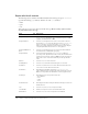
shadowColor Y Format: color; shadow color of the line, as follows:.
• If
strokeWidth is 1, does nothing.
• If
strokeWidth is 2 (default), the color of the bottom line.
• If
strokeWidth is greater than 2, the color of the bottom and right
edges of the rectangle.
The default value is ##D4D0C8.
strokeWidth Y Thickness of the rule in pixels, as follows:
• If
strokeWidth is 1, the rule is a 1-pixel-wide line.
• If
strokeWidth is 2 (default), the rule is two adjacent 1-pixel-wide
horizontal lines.
• If
strokeWidth is greater than 2, the rule is a hollow rectangle with
1-pixel-wide edges.
The default value is 2.
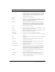
Style Inh Description
borderThickness N Thickness of border "ring". A value of 0 means no border. Any
value greater than 2 creates a glowing "ring" around the button.
The default value is 3.
cornerRadius N Radius of corners. The default value is 5.
horizontalGap N Gap between the label and the image in an
img input when
labelPlacement = "left" or "right". The default value is 2.
repeatDelay N Format: time; number of milliseconds to wait after the first
buttonDown event before repeating buttonDown events at the
repeatInterval. The default value is 500.
repeatInterval N Format: time; number of milliseconds between buttonDown events
if you press and hold a button. The default value is 35.
symbolBackgroundColor Y Format: color; background color of check boxes and radio buttons.
The default value is ##FFFFFF (white).
symbolBackground
DisabledColor
Y Format: color; background color of check boxes and radio buttons
when disabled. The default value is ##EFEEEF (light gray).
Style Inh Description