
User Guide

cfgrid 189
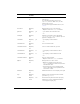
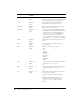
textColor Optional;
All
Black Color of text. Can be a hexadecimal value or a
named color.
For a hexadecimal value, use the form
"
##xxxxxx", where x = 0-9 or A-F; use two
number signs or none.
For a list of the supported named colors, see
cfchart.
selectColor Optional;
All
Background color for a selected item.
• Options: same as for
textColor attribute
gridLines Optional;
All
yes • yes: enables row and column rules.
• no
rowHeight Optional;
All
Minimum row height, in pixels. Used with
cfgridcolumn type = "Image"; defines space for
graphics to display in row.
colHeaders Optional;
All
yes • yes: displays column headers.
• no
colHeaderFont Optional;
All
Font of column header.
colHeaderFontSize Optional;
All
Size of column header text, in points.
colHeaderItalic Optional;
All
no • yes: displays column headers in italics.
• no
colHeaderBold Optional;
All
no • yes: displays column headers in bold.
• no
colHeaderTextColor Optional;
All
Color of column headers.
• Options: same as for
textColor attribute.
bgColor Optional;
All
Background color of the control.
• Options: for applet format, same as for
textColor attribute; for Flash format, must be
a hexadecimal value.
• Flash format only: to specify background
colors for alternating rows, separate the two
colors with a comma.
maxRows Optional;
All
Maximum number of rows to display in the grid.
style Optional;
Flash
Must be a style specification in CSS format.
Ignored for
type="text".
enabled Optional;
Flash
Yes Flash format only: Boolean value specifying
whether the control is enabled. A disabled
control appears in light gray.
Attribute Req/Opt;
Formats
Default Description