
User Guide

149
Defining controls
This section contains only two kinds of tags: CONTROL and CONTAINER tags. CONTROL and
CONTAINER tags represent graphical controls. The tags are identical in definition, with
the exception that only
CONTAINER tags have the capability to contain CONTROL tags.
A Panel control is a good example of a control that can be a
CONTAINER containing a
CONTROL, such as Labels or TextBoxes.
Look at the following example:
<TAG>
<EDITORLAYOUT HEIGHT=50 WIDTH=200>
<CONTAINER NAME="Panel1" TYPE="Panel" WIDTH=150 HEIGHT=50>
<CONTROL NAME="lblCode" TYPE="label" CAPTION="Code" DOWN=20
RIGHT=20 WIDTH=70/>
<CONTROL NAME="txtCode" TYPE="TextBox" ANCHOR="lblCode"
<CORNER="NE" WIDTH="30"/>
</CONTAINER>
</EDITORLAYOUT>
</TAG>
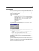
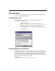
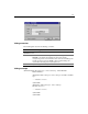
You can name the above template MYTAG.VTM and test it by attempting to edit an
empty MYTAG tag. The tag editor looks like this:
The example displays a single Panel
CONTAINER containing Label and TextBox controls.
Only a few controls can be containers:
• Ta bD ia l og — A tab dialog control capable of containing TabPage container
controls.
• Ta bPa ge — Only used inside a TabDialog container control.
• Panel — A general purpose panel container control which can contain any
regular or container controls.
You might have noticed that the control represented by a
CONTROL or a CONTAINER tag is
defined by the
TYPE attribute. We can also see that WIDTH and HEIGHT attributes
determine the size.
The ANCHOR and CORNER attributes determine the point relative to which the control is
positioned. The
ANCHOR can be specified as the name of any control that was already
laid down. The corner specifies the corner of the anchor control to be used for
positioning. The possible choices are
NE, NW, SE, and SW. The DOWN and RIGHT attributes
then specify the pixel offset from the anchor control.