
User Guide


cfinput 201
cfinput
Description
Used within the cfform tag, to place radio buttons, check boxes, or text boxes on a form.
Provides input validation for the specified control type.
Category
Forms tags
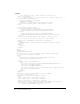
Syntax
<cfinput
type = "input_type"
name = "name"
value = "initial_value"
required = "Yes" or "No"
range = "min_value, max_value"
validate = "data_type"
onValidate = "javascript_function"
pattern = "regexp"
message = "validation_msg"
onError = "text"
size = "integer"
maxLength = "integer"
checked
passThrough = "HTML_attributes">
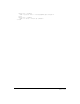
See also
cfapplet, cfform, cfgrid, cfselect, cfslider, cftextinput, cftree
History
ColdFusion MX 6.1: Changed the requirements for the validate = "creditcard" option: it
requires that the text entry have 13-16 digits.
ColdFusion MX: Changed the
cfform tag preserveData attribute behavior: if it is set to True,
ColdFusion checks radio and check box values only if their value matches the posted value for the
control. (In earlier releases, if the posted value did not match any of the
cfinput check boxes or
radio buttons for the control, the
checked attribute was used.
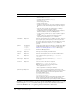
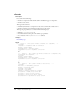
Attributes
<em>
Attribute Req/Opt Default Description
type Optional text • text: creates a text entry box control
• radio: creates a radio button control
• checkbox: creates a check box control
• password: creates a password entry control
name Required Name for form input element.
value Optional Initial value for form input element.
required Optional No • Yes
• No
range Optional Minimum and maximum value range, separated by a comma.
If
type = "text" or "password", this applies only to numeric
data.