
User Guide

cfgridcolumn 163
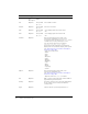
select Optional • Yes: user can select the column in grid control.
• No: user cannot edit column, regardless of
cfgrid
insert and delete values. If cfgrid selectMode =
"Row" or "Browse", this value is ignored.
display Optional Yes • Yes
• No: hides column
type Optional • image: grid displays image that corresponds to
value in column (a built-in ColdFusion image
name, or an image in cfide\classes directory or
subdirectory referenced with relative URL). If
image is larger than column cell, it is clipped to fit.
Built-in image names are as follows:
- cd
- computer
- document
- element
- folder
- floppy
- fixed
- remote
• numeric: user can sort grid data numerically
• boolean: column displays as check box; if cell is
editable, user can change checkmark
• string_noCase: user can sort grid data as
case-insensitive text
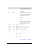
headerFont Optional as specified
by
cfgrid
Column header font
headerFontSize Optional as specified
by
cfgrid
Column header text size, in pixels
headerItalic Optional as specified
by
cfgrid
• Yes: displays column header in italics
• No
headerBold Optional as specified
by
cfgrid
• Yes: displays header in bold
• No
headerTextColor Optional Color of grid control column header text.
• Options: same as for
textColor attribute
dataAlign Optional as specified
by
cfgrid
Column data alignment:
• Left
• Right
• Center
headerAlign Optional as specified
by
cfgrid
Column header text alignment:
• Left
• Right
• Center
numberFormat Optional Format for displaying numeric data in grid. See
“numberFormat mask characters” on page 165.
Attribute Req/Opt Default Description