
User Guide


cfgrid 155
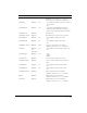
rowHeight Optional Minimum row height, in pixels, of grid control.
Used with
cfgridcolumn type = "Image";
defines space for graphics to display in row.
rowHeaders Optional Yes • Yes: displays a column of numeric row labels
in grid control
• No
rowHeaderAlign Optional Left • Left: left-aligns data within row header
• Right: right-aligns data within row header
• Center: center-aligns data within row header
rowHeaderFont Optional Row label font.
rowHeaderFontSize Optional Row label text size in grid control, in points.
rowHeaderItalic Optional No • Yes: displays row label text in italic
• No
rowHeaderBold Optional No • Yes: displays row label text in bold
• No
rowHeaderTextColor Optional Black Text color of grid control row headers.
• Options: same as for
textColor attribute
colHeaders Optional;
see
description
Yes • Yes: displays column headers in grid control
• No
colHeaderAlign Optional Left • Left
• Right
• Center
colHeaderFont Optional Font of column header in grid control.
colHeaderFontSize Optional Size of column header text in grid control, in
points.
colHeaderItalic Optional No • Yes: displays column headers in italics
• No
colHeaderBold Optional No • Yes: displays column headers in bold
• No
colHeaderTextColor Optional Color of grid control column headers.
• Options: same as for
textColor attribute
bgColor Optional Background color of grid control.
• Options: same as for
textColor attribute
selectColor Optional Background color for a selected item.
• Options: same as for
textColor attribute
Attribute Req/Opt Default Description