
User Manual
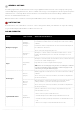

General Elements
All of the Round Buttons and some of the Square
Buttons are customizable. These control elements
are generally used across all areas of your editing
software and their function remains constant and
fixed and does not change alongside the editing
software used.
All buttons are equipped with RGB color backlight,
which is used to indicate the type of action
assigned to the button.
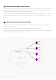
Workspace Elements
The content of Dials, Touch Buttons and The Wheel
changes based on the current workspace and all
content is fully customizable.
Dials are separated into two banks (located on
the left and right). Dials control variable values
(e.g., slider values, brush size, levels, etc.). Dials also
have a press function, which is usually assigned to
resetting the value back to zero.
Dial information is displayed on the left and right
bars of the Touch Screen (next to the dials).
Touch Buttons are used to activate different functions (e.g., tools, macros, presets, and actions). Touch
buttons have back-colored icons which indicate the type of the function assigned – icon colors match with
the buttons’ backlight color.
The Wheel combines both dial and button functions and can be used to control both variable values and to
activate functions.
The Wheel has a number of different kinds of templates (e.g., lists, “action cakes”, etc.) and widgets (e.g.,
color wheel and clock), which are selected based on the functions needed.
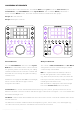
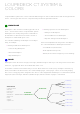
LOUPEDECK CT ELEMENTS
Loupedeck CT’s control elements are: Six rotatable Dials (with a press function), Touch Screen (with
Touch Buttons), eight Round Buttons, twelve Square Buttons and a rotatable Wheel (paired with a
touch-sensitive Wheel Screen). These five elements have been divided into two groups.
Group 1: General elements
Group 2: Workspace elements
Copyright (c) 2017 Loupedeck Ltd. All rights reserved. 4