
User Manual
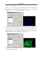

Help Manual
96
If Color Value Slider is the selected (highlighted) selected control, then you can also
control the slider with keyboard strokes:
Use the left/right arrow <-> or <->keys to move the slider incrementally.
Press the <Page Up> and <Page Down> to move the slider in “chunk” sections along
the Color Bar.
Use the <Home> and <End> keys to move the slider to the beginning and end of the
Color Bar.
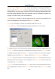
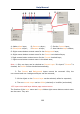
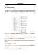
Selected: This color block displays the new Color selected by the Color Value slider
bar or the Color Palette.
Selected Color: The Selected Color text field displays the corresponding numeric
Color value of the Selected color block described above. The Selected Color value is
expressed as an RGB color, with the red value first, followed by the green and blue
values. If the color corresponds to a dye color, the dye name will be displayed. If the
dye color corresponds to a color palette color, the name of the color will also be
displayed.
Current: The Current color block displays the starting Color of the channel.
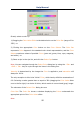
Color Palette: The Color Palette proves an alternate method of selecting a Color.
Clicking on an item in the Color Palette will set the Color Value slider to the correct
value and update the displays in both the Selected color block and Selected Color
text field.
For example, clicking on the white button on the Color Palette will set the Color Value
slider to the right, change the Selected color block to white, and cause the Selected
Color text box to display “White”.
Adjust: The controls in this section are used to adjust the color composite
contribution from each image, or for the color composite preview itself. You can
adjust the input image that is currently selected in the Colors list by clicking the
selected button. When you want to adjust the color composite preview, or you want
no image is selected in the Colors list, use the All button.