
Beginner's Guide

Today, this concept can be found not only in the templates, but in the entire Joomla Standard output.
In the development of Joomla 1.6, this was a central part of the development work. Reasons were, in
addition to better usability in assistive technologies, also search engine optimization and better usability
in mobile devices. Well-structured code not only helps people with disabilities better navigate within a
site, even Google feels better with such a well-structured site.
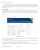
Anchor Links
Linear presentation of content has a big drawback: You may have to travel a very long way, in order
to access "in the back lying" areas of content.
On the screen, a three-column layout allows that a number of areas begin “above" and the eye can jump
right to it, where it, supported by visual aids, suspects interesting information.
Remedy offers the concept of anchors. It is, in fact, a non-visual counterpart to the graphical layout
and allows the user of linear playback devices to identify key content areas at the beginning of the page
and then immediately jump to the area where he/she believes the information of his/her interest lies.
Practically, the use of anchors means, to set up an additional menu at the top of each page for
internal navigation of the page. In most cases it will be useful to hide this menu from the graphical
layout. It's irritating for users, that can see, to click a link, but nothing (apparently) is happening, because
the link target is already visible in the viewport.
In any case, the "anchor links menu" should be not too long and built in a very well thought-through
manner, because it extends and complicates, due to the linearisation itself, the path of perception. In
general, it's advisable to offer the main content as the first target jump, then regular visitors, who know
the site and handle the navigation specifically, have the shortest way to where they actually want to go to.
At least here it becomes clear that, particularly websites with more complex content pages do not
only need a graphical layout, but also a content design that aims to arrange the content in a form that it
contains no unnecessary barriers for the users of linearising clients.
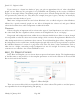
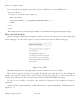
Example:
<ul class="skiplinks">
<li><a href="#main" class="u2">Skip to content</a></li>
<li><a href="#nav" class="u2">Jump to main navigation and login</a></li>
</ul>
The Colour Choice
The colour choice is, in the context of accessibility, of particular importance because even people
with impaired colour vision should be able to use your website fully.
Joomla! 2.5 - Beginner’s Guide
Monday, 30 January 2012! Page 205