
HPjmeter 4.3 User's Guide
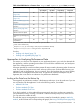
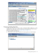
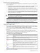

HPjmeter automatically recalculates the call count for each method in the peak data with the result
that each value is normalized to the ratio of the call counts for the selected method.
HPjmeter then sorts the data. By viewing the information that appears in the newly sorted list, you
can compare differences in activity between the two data files. If you want to see how this works
in detail, select View→Show Formula to display the calculations that HPjmeter uses.
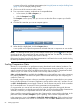
Reading Profiling Histograms
There are two kinds of histograms available:
• Threads Histogram. A presentation of all threads created by the application.
The horizontal bars represent the lifetime of the threads, with respect to the lifetime of the
whole application.
• Thread Groups Histogram. A presentation of all thread groups created by the application.
The horizontal bars represent the lifetime of the thread groups, with respect to the lifetime of
the whole application. The lifetime of the thread group is defined as the time span between
the creation of the first thread belonging to the group and the death of the last thread belonging
to the group.
Not all profile data files contain information about the times when the threads are created and
terminated. If such information is unavailable, the metric header will contain “times not to scale)”
meaning that only the order of the threads creation and termination events are shown.
If the profile data contains adequate information, the bars are displayed using colors describing
thread states; otherwise the bars are gray. There are a few coloring schemas used by HPjmeter,
depending on the profiling option and platform used. You can double click on the thread (or thread
group) bar to pop up the thread spectrum.
The next section presents a detailed description of the reported thread states.
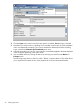
Key to Thread States Reported by
-Xeprof
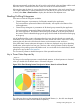
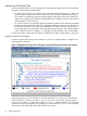
The image in the next figure presents a sample thread spectrum. A thread spectrum is obtained
when you double-click the thread name in a threads histogram.
Figure 15 Pie Chart Showing Percent Time Spent in Various States for a Given Thread
The values are shown as the percentage of the total thread lifetime (i.e., the clock time elapsed
between the thread creation and the thread completion).
Reading Profiling Histograms 87