
HPjmeter 4.3 User's Guide
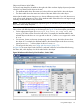
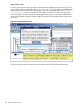
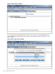
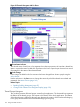
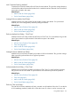
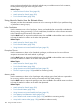

Figure 59 Threads Histogram with Pie Chart
Thread state indicator
The colored areas of each line or line segment show relative proportions of time that a thread has
spent in a particular state. Double-click anywhere on the line to open the pie chart and see actual
percentages for the states of the selected thread.
Color change
In this image, the default color for starvation has been changed from white to purple using the
color chooser.
Use the selections in the Sort menu to change the criteria by which the threads are ordered and
presented. See Menu Choices (page 163)
Related Topics
• Reading Profiling Histograms (page 87)
• Change Color Selection for Histogram Display (page 210)
Thread Groups Histogram
This visualizer presents all thread groups created by the application. The horizontal bars represent
the lifetime of the thread groups, with respect to the lifetime of the whole application. The lifetime
of the thread group is defined as the time span between the creation of the first thread belonging
to the group and the death of the last thread belonging to the group.
176 Using Visualizer Functions