
User Guide


FontLab 4
574
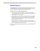
Hinting White Space
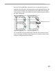
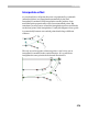
Sometimes it’s necessary to set the width of the white space inside a
character, especially with a narrow character that has more than one
vertical stem. Take the character “H” as an example. With normal fonts we
usually use two double links to set the widths of vertical stems:
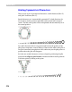
Because at all PPM sizes we will have enough space between stems we
don’t really care about white space. But look what happens if we try to use
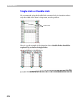
the same technique with a narrow font:
At many PPMs the vertical stems are snapped together and the character
becomes completely unreadable.