
User Guide

FontLab 4
346
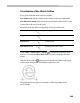
A l i g nm e n t Z o n e s
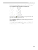
Most fonts have “square” and “round” glyphs. Round glyphs (like “O” and
“Q”) usually have 3-4% “overshoot” on the bottom and top. “Overshoot” is
the amount that a glyph extends above or below its nominal top or bottom.
It is used to optically correct the appearance of “round” glyphs, which tend
to appear too small at their nominal height.
When a font is rendered on a device with limited resolution, it is often
necessary to “suppress” the overshoots to make a line of text look smooth:
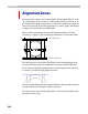
Top alignment zone
Bottom alignment zone
This whole process is described in full detail in the Hinting chapter. Here
we will only discuss the basic modification of the layer with the Edit tool.
To let a font-rendering program perform overshoot suppression you need
to “declare” overshoots using alignment zones:
You can modify alignment zones with the Edit tool: just drag the bottom or
top line of the zone to change its width or position.
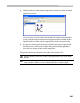
You may later use the FontInfo dialog (File > Font Info) to check the exact
parameters of the zones.