
User Guide


Font Header
205
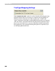
Font Smoothing Control
To improve the appearance of TrueType fonts on the screen the latest
versions of the Windows operating system use a special technique called
font smoothing. With this technique edges of the characters are rendered
using shades of gray:
Visually this decreases the dither of the characters’ edges so that text is
easier to read. This technique may be combined with gridfitting methods
that optimize the character’s appearance by adjusting its outline.
The font smoothing options let you control when to use one or both of
these techniques.
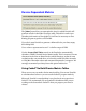
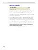
In the list box you see PPM (Pixels Per eM — font size measured in screen
pixels) ranges with one or two letters describing the applied technique.
S means that smoothing will be applied; G means that gridfitting will be
applied; SG means that both techniques will be combined to achieve the
best results.