
User Guide
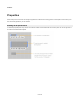


Modules
Control Types
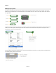
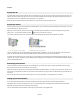
Each of the five property enabled component types has a control that represents it on the Properties panel. There are just three different
types of control.
Float, Int and String components are represented by Edit controls. These have a label which takes it’s text from the label of the component.
Boolean components are shown as a check box. Again the label for the check box uses the text from the label of the Boolean component
The Trigger Button component is represented by a button. The button text is taken from the label assigned to the Trigger Button component.
The Index Selector component is used for selecting from a list of options so this is represented as a drop-down list. The component label
once again supplies the text for the control label.
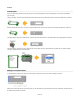
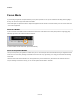
Editing the Properties Panel
To edit the positions of items on the panel just unlock the panel, exactly the same as you would for editing a front panel.
Editing is then exactly the same as for the front panel. You can select items, drag and nudge items around or resize them. See the section on
the module front panel for more details.
63 of 212