
User Guide


Modules
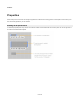
Adding Property Items
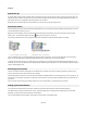
The items on the property panel each map onto a particular component somewhere within the module or it’s sub-modules. There are six
different types of components that can be enabled for display on the properties panel. They are: Int, Float, String, Boolean, Index Selector
and Trigger Button.
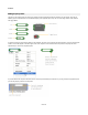
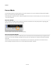
To enable one of these components for display on the properties, right-click on the component and select Property. You’ll see a small tag with
a letter P in the middle appear in the bottom-right corner of the component. This indicates that this component is a Property and will be
represented by a control on the Properties panel.
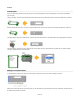
If you add a label to the component this will be used on the front panel to identify the component. If you now go back to the properties panel
you’ll see the property control for the component.
62 of 212