
Reference


Components
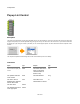
Popup List Control
Description
The Popup List Control defines a popup list of selectable values. You need to define an area on the View where the control is to appear and
supply a list of options (via a comma separated string). Having done this you can then click on the control and, as you hold the mouse down,
the list will pop up. By moving the mouse up and down you can scroll through the options. You then release the mouse to accept the current
selection.
The component outputs the selected string and the index of the selection (which is zero based).
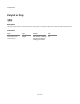
Connectors
Inputs Type Outputs Type
View on which to display the
control
View The same View as the
input, but anything
connected here is
drawn on top
View
The position and size
of the control
Area The selected item
String
The font to use for
displaying the selected
item on the control
Font The index of the
selected item in the list
Int
The text colour Colour
The background colour
of the pop up list
Colour
343 of 494