
Reference
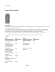


Components
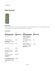
Drop List Control
Description
The Drop List Control defines a drop list of selectable values. The drop-list is displayed when you send a trigger to the Open input. The drop-
list closes when you select an item from the list.
You can decide whether to check an item in the list, usually to show the current selection. You can also choose the style of the list when
there are too many items to show vertically on the screen. The default (if you leave the style blank) is “AutoCol” this will split the list into
vertical columns. You can also specify the exact number of items per column manually by using a number for the style.
The other option for style is “Scroll” - this will maintain a single column but with scroll buttons at either end to scroll through the list.
For a good example of how the Drop List control works have a look inside the Selector control module in the toolbox.
Connectors
Inputs Type Outputs Type
View on which to display the
list when it opens
View The last selected list
item
String
The desired x-
coordinate of the top-
left corner of the list
when it is opened
Float The index of the
selected list item
Int
The desired y-
coordinate of the top-
left corner of the list
when it is opened
Float The number of entries
in the list
Int
Comma separated list
of entries
String
Trigger to open the
drop-list
Trigger
Index of item to show
as checked
Int
The drop-list style,
either
String
88 of 494