
User's Guide
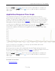
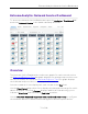
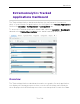
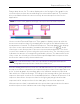
Table Of Contents
- ExtremeAnalytics® User GuideVersion 8.4
- Legal Notices
- Trademarks
- Contact
- Extreme Networks® Software License Agreement
- Table of Contents
- ExtremeAnalytics™ Help
- ExtremeAnalytics Licensing
- Configuring Enhanced Netflow for Extreme Analytics and Extreme Wireless Contr...
- How to Deploy ExtremeAnalytics in an MSP or MSSP Environment
- ExtremeAnalytics Tab Overview
- ExtremeAnalytics Dashboard Overview
- ExtremeAnalytics Insights Dashboard
- ExtremeAnalytics Tracked Applications Dashboard
- ExtremeAnalytics Browser Overview
- ExtremeAnalytics Application Flows
- ExtremeAnalytics Fingerprints Overview
- ExtremeAnalytics Custom Fingerprints
- Delete Custom Fingerprints
- Custom Fingerprint Examples
- Create Custom Fingerprints Based on Flow
- Create Custom Fingerprints Based on Destination Address
- Create Custom Fingerprints Based on Application or Application Group
- ExtremeAnalytics Packet Captures
- ExtremeAnalytics Configuration Overview
- Virtual Sensors
- ExtremeAnalytics Engine Advanced Configuration
- Flow Collection Type
- Collection Privacy Levels
- Client Aggregation
- Slow Client Data
- Max End-Systems in Hourly Details
- Sensor Log Levels
- Store Application Site Data
- ExtremeControl Integration
- Flow Sources/Application Telemetry Sources
- Web Credentials
- Configuration Properties
- Sensor Modules
- Auditing
- Network Settings
- ExtremeAnalytics Reports
- ExtremeAnalytics Report Descriptions
- Report Descriptions
- Analytics Events
- Bandwidth for a Client Over Time
- Interface Top Applications Treemap
- Sites Using the Most Bandwidth
- Most Popular Applications
- Most Used Applications for a Client
- Most Used Applications for a User Name
- Network Activity by Site
- Network Activity by Client
- Network Activity by Application
- Slowest Applications by Site
- Top Applications Group Radar
- Top Applications Radar
- Top Applications TreeMap
- Top Applications for Interface
- Top Applications for Server
- Top Clients by Interface
- Top Interfaces by Application
- Top N Applications
- Top N Clients
- Top N Servers
- Report Descriptions
- Add and Modify Fingerprints
- Add Fingerprints
- Enable or Disable Fingerprints
- Modify Fingerprints
- Update Fingerprints
- Custom Fingerprint Examples
- How to Deploy ExtremeAnalytics in an MSP or MSSP Environment
- ExtremeAnalytics Virtual Sensor Configuration in Extreme Management Center
- Stream Flow Data from ExtremeAnalytics into Splunk
- Stream Flow Data from ExtremeAnalytics into Elastic Stack

Expected Response Time
75 of 218
displaying a given application or site pair. The data below this threshold is not
reliable and may set off a false alarm, however, you can adjust how much data is
required based on the individual needs of your network.
The Network Service Dashboard displays the performance (in response time) of
your network services. Each column in the dashboard represents a service:
l ALL
l DHCP
l DNS
l Kerberos
l LDAP
l RADIUS
The top graphs for each service displays the average response time of all of the
sites for that service, while the following rows indicate the top worst performing
sites for that service.
You can display or hide any of the application columns using the Views drop-
down list. You can also click the Xat the top of a column to hide the column
from the dashboard. Click the Single Row icon ( ) to display all columns in a
single row, or click the Double Row icon ( ) to display the columns in two
rows.
The worst performing sites are defined as those whose response time is the
slowest when compared to the expected response time observed over the
selected time period. For example, a site with an average RADIUSauthentication
response time of 40 ms over the past seven days that displayed a slowest
response time of 50 ms would rank as a better performing site than a site with an
average RADIUSauthentication response time of 5 ms over the same period that
displayed a slowest response time of 30 ms.
Expected Response Time
The Expected Response Time bar graph displays the range of response times,
the most recently measured response time, and the expected response time for a
network service a specific site during the date range you configure in the Date
Range drop-down list. The value displayed on the far right of the graph is the