
User's Manual Part 2
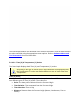

A Data Plot in the Data Graph can be suppressed or restored at any time by clicking the
channel check box with the corresponding sensor description in the Data Table. This
allows the user to view any combination of the Data Plots or individually.
When two or more Data Plots overlap the same values, the Data Plots
overwrite each other. For example, if the Data Plot that represents the sensor
connected to channel 5 and channel 1 have the same value, the channel 5
Data Plot will only appear unless the user suppresses it.
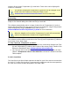
When printing a Data Graph in black and white, suppressing one or more Data Plots is
useful for clearing a view of a Data Plot that is obscured by others near it. The Notes tool
can also be used to help identify each Data Plot. Refer to topic
Software>Menus>Tools>Notes for more information.
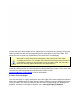
5.4.4.2.3. Process Origin
The Process Origin is a gray vertical line at the left edge of the Data Graph that indicates
where the assembly process starts. When Points or Distance units are being used for the
Time (X) values, the Time (X) values to the left of the Process Origin are displayed as
negative and those to the right as positive in the Time (X)/Temp (Y) Readout.