FastGraph Version 3.x Edge Ware, Inc. www.edge-ware.
Disclaimer and License Agreement The information that FastGraph provides is only part of the information needed for a good investment program. Consult your mutual fund representative before buying or selling any fund. Read the prospectus to determine whether an investment meets your objectives. EDGE WARE, INC. DOES NOT RECOMMEND SPECIFIC INVESTMENTS SUITABLE FOR YOUR PERSONAL OBJECTIVES BUT IS LIMITED TO PROVIDING INFORMATION FROM THE BEST AVAILABLE SOURCES.
Table of Contents 1.0 Introduction................................................................... 4 2.0 Upgrade Notes .............................................................. 5 3.0 Technical Support and Upgrades .................................. 6 4.0 Installing FastGraph...................................................... 8 5.0 FastGraph Quick Start................................................. 11 6.0 Analyzing FastBreak Output....................................... 18 7.
1.0 Introduction First, a little background. FastGraph is a product of Edge Ware, Inc. which was founded by brothers, Ken and Nelson Huck. Ken is an engineer with 20 years of experience in technical analysis and computer simulation in the aerospace industry. Nelson is a programmer/MBA with 10 years experience in financial programming. After developing an investment software tool called FastBreak*, Edge Ware found a need for graphical tools that were not readily available in other programs.
2.0 Upgrade Notes Below are a few changes to the manual that reflect the enhancements made with Version 3.0 of FastGraph. FastGraph now loads all the FastTrack mutual fund and stock databases at the same time when “FastTrack Funds, Stocks & FNU files” is selected in the following menu: Starting with Standard FastBreak 4.0 and FastBreak Pro 4.0 three new data fields were added in the Summary output: Beta, Correlation, and Alpha.
3.0 Technical Support and Upgrades Note: Do not call Investors FastTrack for technical support. Do not use the 800 order line number for technical support. This is a commercial order line that only takes orders and they are not equipped to answer any questions. Any messages left with the order line will not be returned. Please read this entire manual and check the FAQ chapter before calling for support. We have tried to make this software and documentation as user-friendly as possible.
Go to our web site and download the latest upgrade, if one exists Upgrades We provide minor upgrades to FastGraph on our web site, and if you encounter an error, we suggest you download the latest version of the software because this will often solve the problem. The Edge Ware Internet Web site (www.edge-ware.com) always has the latest version for download.
4.0 Installing FastGraph Note: We have found that FastGraph installs with the least number of problems when the installation is made just after booting your computer. Also, before you start the installation make a backup copy of the installation disks. To install FastGraph: Minimum of 5 MB free on your hard drive Windows operating system Note: FastGraph will not run under Windows 3.1 16 MB RAM Pentium class processor 1) Start Windows 2) Stop any application that may be running.
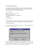
5) The second screen you will see is: The setup program is asking the name of the drive and directory where FastGraph is to be installed. The default is C:\FTGRAPH, and we suggest that you use the default directory name. If the default is acceptable click on the button that resembles a computer and skip to step 8.
A FastGraph run icon will be created in your Windows Programs environment. Click the FastGraph icon as you would to launch any application. Reinstalling FastGraph Reinstalling FastGraph is our number one tech support problem. Users crash hard drives, buy new computers, new laptops, etc. You MUST use the installation CD to reinstall. We have had a number of users just try to copy files to the new computer or hard drive. This will not work.
5.0 FastGraph Quick Start FastGraph is run from the Windows environment and your installation should have created an icon under Programs when you use the Start button. Click the icon as you would to launch any application. When FastGraph is launched the main menu will appear: The menu may initially look very complicated but is quite logical and user friendly. We will step through each menu and describe each feature. FastGraph uses the very common Windows Tool Bar method of presenting functions and data.
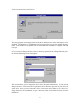
File Name When the File Name button is selected the following menu will appear: This menu allows you to find and load the appropriate file. Use the Drive and Directories boxes to find the data files. Select the file from the left side of the screen and click the OK button. Graph Parameter Settings These pulldown menus allow you to change the graph parameter settings and are self explanatory. % of data to graph This menu item allows for graphing only part of the loaded data.
and the far right icon brings up the Calculations Screen. These icons will be described later in the chapter. Loading FastTrack Data Note: When you select FastTrack as the data type a large number of new items appear on the main screen. Some of these will be explained now, others will be explained in Chapter 7.
A fund can be found by typing the fund symbol as you did the family name. To select multiple fund names FastGraph uses the standard Windows selection method: hold the Control key on your keyboard and “click” the left mouse button to select additional funds. In the above example both FSELX and FSESX have been selected. Note: FastGraph will read all your FNU files. When these files are made part of your trading family, FastGraph will include them in the graph.
After loading data from the select file, the data can be reviewed in a spread sheet by selecting the Data screen icon. Going to the Data screen icon the data will resemble the following: Different parts of the data can be reviewed by using the slide bars or page up and page down keys. This screen will be covered in more detail later. The data is loaded on a distribution included basis, i.e.
Graph This tool bar icon allows the user to produce a graph. When the icon item is selected FastGraph will go into a graphing mode and bring up the Graph Screen.
Changing the Time Period Displayed The slide bar at the bottom of the graph can be used to view different graph start and stop times. Changing the Graph Time Period When FastTrack data has been selected the time period of the graph can be changed by using the Time Period pulldown menu. A variety of time periods can be selected. Printing the Graph and Other Options Placed the cursor on the FastGraph Graph Tab screen and click the right mouse button. The above menu is displayed.
6.0 Analyzing FastBreak Output FastBreak summary files can be analyzed using FastGraph, and this is where the real power of FastBreak can be realized. This example will compare the effect of changing a single parameter on return results of a trading strategy.
In this example, the + symbols represent test cases holding one fund, and the * symbols represent three funds. The first thing to notice is the large variation in annual performance when holding one fund. It is rather difficult to determine the average effect on return by holding one fund vs. three funds. However, there is a solution. Sort When the Sort icon is selected the following menu appears: This menu allows you to sort the data in the spread sheet by a variety of criteria.
Now it becomes clear that holding one fund can have a return of more than 5% per year when compared to holding three funds. However, it is also clear that holding three funds can give more consistent performance regardless of ranking period. If you want to look closer at the best test cases go to the Graph main screen and select 50% in the “% data to graph” menu. Now, re-graph the data: Now only the best half of the test cases are shown but in greater detail.
Finally, what are the best parameters to use for buy and sell ranking? The values that gave the best annual return may not be the best choice because that combination may have undesirable characteristics, i.e., high drawn down, too many switches per year, etc. The most significant problem - the parameters may not be a good “robust solution” and only a “statistical fluke.” Stability is a requirement in your parameter choice.
The areas can be further evaluated by looking at UPI, UI, S/Y etc. The following graph was made by selecting UPI as the Data Field: All regions still look reasonable, but the buy 16/sell 45 does a little better. There are no guarantees the ranking period that tested well in the past will work well in the future. However, looking at the past performance may give an indication of what will work in the future, and you certainly don’t want to choose a parameter set that performed poorly in the past.
7.0 Analyzing FastWays Output FastWays is a FastTrack add-on product (see Resources Chapter for more information) that can evaluate a variety of FastTrack functions: AccuTrack, Stochastic, Moving Average, and MACD. FastWays output can be analyzed in a graphical manner to help select optimum/robust parameters. Note: When running FastWays select the “Fixed length” type for file output.
Note: If you have any doubt about the effectiveness of this AccuTrack strategy here are the buy and hold values for each fund and the S&P 500 index over the same time period: FSENX FSESX FSRFX S&P 500 156% 227% 225% 197% The AccuTrack system easily beats these values using ANY set of parameters. It is also clear that trading Transportation with Energy Service is the preferred pair. The next step is to determine the AccuTrack parameters that give a good robust strategy.
Ways runs using your fund of choice and switch between different indexes. Next, load these FastWays files into FastGraph, sort, and compare the different line graphs. It should make the selection of an index more obvious. FastWays Example #2 - Moving Average FastWays/FastGraph can be used to find robust parameters for a moving average. Make a FastWays run using the OTC-C index as the fund and Vanguard Money Market fund (VMMXX) as the index. Run with a moving average range of 10 days to 250 days.
Selecting Switches per Year give the following graph: The number of switches is a reasonable 2-4 per year for the most favorable Ma. Finally, charting risk: The risk (percent time invested in the OTC index) for the most favorable moving average values is in the range of 70-75% Maximum Draw Down (MDD) could be examined to determine the benefit of using the moving average vs. buy and hold.
FastWays Example #3 - MACD Since the functions that FastWays evaluates have different number of parameters FastGraph changes the graph selection parameters depending on the type of file imported. For example, AccuTrack has two parameters but MACD has three. There is also the issue of how to determine parameters if the function has more than two independent variables. MACD is an example since it has three parameters. Here is a method to help determine good parameter ranges.
8.0 Analyzing FastTrack Data The FastGraph Main screen changes dramatically when FastTrack Funds & FNU Files is selected as the Data Type: Several options become available and we will step through each with an example. FastTrack Example #1 - Multiple Funds The FastTrack DOS has a limitation of comparing only two funds or indexes at once. FastGraph can put many sets of data on a single graph. Here is an example comparing the DJ-30, OTC-C, Fidelity Select Electronics, and Select Air Transportation.
This graph makes it much easier to compare multiple funds and indexes. FastTrack Example #2 - Exponential Moving Average/Adaptive Moving Average Exponential moving average (EMA) analysis is one of the most common techniques in technical analysis. See your FastTrack manual for a description how exponential moving averages are calculated. To display a fund with it’s EMA, first load a FastTrack family or individual funds.
The following graph was made with a 50 day EMA and is displayed for a period of two years: The Adaptive Moving Average (AMA) can be displayed in the same way. See the Appendix for a description of AMA calculation. FastTrack Example #3 - Parabolic The Wilder parabolic is a very common technique to set a stop in trading. See Appendix A for a description of how a parabolic is calculated. To display a fund with its parabolic, first load a FastTrack family or individual funds.
FastTrack Example #4 - Bollinger Bands Bollinger Bands are used by many technical analysts. See Appendix A for an explanation of how Bollinger Bands are calculated. To display a fund with its Bollinger Bands, first load a FastTrack family or individual funds. Next, go to the Data screen and highlight the funds you want to display, go to the main FastGraph screen and select Show Bollinger Bands and enter the number of trading days to use in the calculation - the typical value is 20 days.
FastTrack Example #5 - Candlestick Charts Many traders use Candlestick charts to make trades. Candlestick charts are built using daily open, high, low and close values. With mutual funds the only data available is the daily closing. Some users have found that a “synthetic” Candlestick chart can be useful using weekly data to determine the “open, high, low and closing” values. This is the approach FastGraph uses.
FastTrack Example #6 - Point & Figure Charts Point & Figure (P&F) charting is a technique that has been around for a century. Recently this method of analysis has been making a strong resurgence. Interpretation of P&F charts is beyond the scope of this manual, but see the Resources chapter for a list of books on the subject. To make a P&F chart in FastGraph you first need to import FastTrack data. Next, select Point & Figure as the Graph Type.
This menu will allow you to change the box size values (the defaults are from the Dorsy book which is listed in the Resource chapter) and the Box Reversal values. The next step is to select a time period range. The final step is to use the Graph icon to see the chart: To move through a family of funds, first load the family into FastGraph. Next, go to the Data screen and “select” the columns for those funds you want to view.
FastTrack Example #7 - Correlation Analysis Correlation Analysis allows the comparison of funds and indexes to determine how closely related they may be. FastGraph uses the common Pearson’s correlation to do this analysis. Maximum correlation has a value of 1.0 and negative correlation has a value of -1.0 If an investor is trying to be diversified by holding more than one fund it may be a good idea to hold two funds that have a low correlation. Correlation can also be used for intermarket analysis.
The following chart shows the low, even negative correlation between Fidelity Select Air Transportation and Select Energy Service. The type of correlation shows why the pairing of these two funds using AccuTrack has been a very successful trading strategy. Correlation analysis can be used to show inter-market relationships.
This chart shows the low to very negative correlation between the value of the dollar and the price of gold. This would tend to support the common notion that when the dollar is strong, the price of gold (denominated in dollars) declines. FastTrack Example #8 - Hurst Exponent Analysis Hurst Exponent (HE) calculations are quite involved. See Appendix A for a description of the calculation. The HE is of interest because it can be used to determine if an index or fund has strong trending properties.
9.0 MEM for Cycle Analysis A larger number of market technicians use cycle analysis in their trading. Proponents of cycle analysis will claim that the market moves in somewhat repeatable cycles and if the period(s) of these cycles can be determined then it may be possible to make predictions of short term price movements. Just knowing if the market is in a cycle mode or trending mode can be very important to an investor.
This is a very busy screen. The top half of the screen has the NAV of the index and a moving average line. The bottom half of the screen contains information about the dominant cycles, and finally, the upper right part of the screen has the spectrum of a specific day. Starting with the lower half of the screen there is a solid line (red) that starts at 50 on the left of the screen and cycles between 8 and 50 as it moves from left to right. This line is the period of the dominant cycle period.
point may be when the NAV trades above the trendline and the dominant period goes to 50 days. Spectrum The spectrum in the upper right portion of the screen shows the “power” of each period in the cycle. In the above example the maximum power is in the 50 day period and indicates a high quality trend mode. The following spectrum is characteristic of a cycle mode: This spectrum shows that the dominant cycle is 28 days long and a second, less powerful cycle, at 12 days.
These move along the graph lines as you click the icons. In the lower right corner of the MEM screen you will see: This is the legend for various peaks in the spectrum. In a trending mode only the red dominate period will be displayed on the bottom Power chart. As other peaks appear in the spectrum these will be indicated on the Power chart. For example: This portion of the Power chart shows the red line indicating what the dominant period is doing.
The red NAV line to the right of the * is a 10 day price prediction based on the current spectrum analysis. You can look at past price predictions by moving the mouse cursor to any point along the red NAV line and clicking the left mouse button. The ten day price prediction will appear as a blue line. Here are some examples (in black/white): Note: When trying to make price predictions the placement of the cursor is very sensitive.
When the chart starts on the left the dominant period is fifty days, and therefore a trend mode. In this case it is a down trend and the NAV drops below the trend line shortly after the chart begins. Approximately three months into the chart the dominant period drops to a cyclic mode with a period of about 18 days, however, the length of the dominant period turns up almost instantly and the NAV goes above the trend line. An aggressive trader may want to buy the fund at this point.
10.0 Making Simulated Index Funds Index fund investing has become very popular and some of the new index fund products actually leverage the index. For example, the Rydex Nova fund actually attempts to beat the S&P 500 Index by 50%. Other funds actually take an inverse approach to the index, for example, the Rydex Ursa fund rises when the S&P 500 Index drops and declines in price when the S&P 500 Index increases.
plier. The last issue is to input a starting NAV value for you simulated index. This value isn't very critical because FastTrack and FastBreak work off changes in NAV not the actual value. However, if you build a simulated index fund that declines dramatically over time then this value needs to be made large enough to prevent round off errors as the NAV gets smaller. A good starting value is 100. The last step is to click the Calculate button.
11.0 Calculate Advance/Decline Lines FastGraph can calculate the Advance/Decline (A/D) line for both the New York Stock Exchange (NYSE) and a user specified family. These data are put in a FNU format that can be loaded into FastTrack or FastGraph for viewing. Go to the Calculation screen and you will see the following area: This option will calculate the A/D line for the NYSE. If all the inputs fields are loaded with acceptable values click the “Calc FNU” button.
12.0 Composite Timing Signal Analysis There are no perfect market timing signals. Some users have found that better results are obtained by using combinations or composites of several signals. For example, a strategy could use five separate signals, and the investor would buy into the market when any three or more signals are on a buy, and sell out of the market when two of fewer signals are on buy.
We suggest you use the default suffix. Then click on the save button. Next, enter the starting and ending dates for the period to be analyzed. In addition, add the delay, in days, for the signal. If the signal is to executed the same day it occurs, the delay is zero, and if the signal is executed the next day (most typical for FastTrack users) enter a one day delay. The next step is to select the fund or index to be invested in when you are “in” the market and the fund or index when “out” of the market.
From this graph we see that we get the best annual return when we “Buy” with any three of the four signals in the market. We would sell if there are less than three separate signals on a buy. You can also examine MDD, UI, UPI and switches per year in the same manner if you select a different Y Parameter. To make a Two Dimensional analysis (2D) go back to the Calculations Screen. Now, select: Notice that we now have separate fields for Buy Range and Sell Range.
This graph needs some explanation. This graph indicates the best results are obtained when a Buy is made when any 3 OR MORE signals are on a buy. A sell is made when only 2, 3, 4, 5 OR FEWER signals remain on a buy. At first this may not make sense, but remember FastGraph looks at the direction of the most recent change in the number of signals in the market. The above graph has the best results centered about the point 3/3.
Now click on the Make Signal FNU box which will bring up menus that allows you to fill in the file name, title and symbol name: We can also make a Detail file by selecting the following menu: The Detail file contains the information on each trade and can be loaded into the FastBreak Data Screen. We can also create a Composite signal file that FastTrack can use. This file will be a standard FastTrack signal file that can be placed in the FastTrack Sig directory.
13.0 Frequently Asked Questions Q) Just because a particular strategy works well in back testing, what guarantee is there that that is will work well in the future? A) We are all looking for the perfect trading strategy or tool. There are no guarantees any strategy or indicator will work well in the future. An investor needs to look at his strategy(s) over a variety of market conditions and try to determine if it is a good general solution.
14.0 Resources The Edge Ware Internet web site (www.edge-ware.com) is a good place to visit. Other items of interest will be posted as they become available. FastWays is a product of Software Support Products, LLC. Edge Ware has no financial interest in this product, but we believe it to be a very powerful add-on to FastTrack and have used it for years. See FastTrack commentary number 8100 for additional information. Traders Press is a good source of books on technical analysis.
Appendix A - Technical Discussion Parabolic Stop The parabolic stop system was developed by Welles Wilder and is documented in many books on technical analysis.
Where: X = A simple moving average = ΣXi / N Xi = The daily NAV for days = 1, N N = Total number of days for the calculation. The recommended value is 20 days. σ = Standard Deviation = [ Σ(X i - X) / N] 0.5 Adaptive Moving Average (AMA) There are a number of different methods to calculate adaptive moving averages.
data intensive and this chapter will give a brief overview. Anyone with a deeper interest is directed toward the Edgars book. The HE works with “time series data” which for our purpose will be the daily NAV of a fund or index. The first step is to take the logarithm of the ratio of each daily NAV divided by the previous day’s NAV. The result of the first step is divided into a number of time series. If working with 100 days of daily data, for example, you may divide it into four periods of 25 days each.