
User manual


58 LogGraph
DE Dostmann Electronic GmbH
5 Presentation of graphs and tables
As soon as the presentation of graph and/or table is opened, other processing
points are available in the program menu. They are used to change the
visualizations, to enter key values for presentation, and to export data or graphs from
measurement tables.
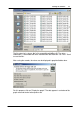
The presentation can be displayed in three different ways:
• as pure graph (without table)
• as combined presentation (graph and table)
• as pure table (without graph)
When displaying a graph for the first time, the minimum and maximum values of the
temperature and time axis and the scales in the ratio (grid lines) are automatically
selected. On the left side, there are the temperature axis labels and at the bottom,
the time axis labels.
In the graph, the control elements for quick change of axis scalings are available on
the left of the temperature axis, below the time axis. The minimum or maximum value
shown is changed using the Up/Down button on the temperature axis or the Left/
Right button on the time axis. In this case, the respective automatic axis scaling is
disabled. The changes are always done in increments of the current grid line
spacing. The automatic axis scaling of the respective minimum or maximum values
of the axis is reactivated again using the automatic buttons Auto-up/-down or Auto-
left /-right.
If there is only one series of measurements, it is shown stretched over a period of 1
sec (otherwise the graph would appear empty because no single point is visible).
Within the graph, the right and left mouse button can be used to change the image
section (see 5.4.2 Process the graph views).