
Users Guide


controlled by clicking the image of the required component. When a component is present in the chassis, an icon of that component
type is shown in the graphics in the position (slot) where the component has been installed. Empty positions are shown with a
charcoal gray background. The component icon visually indicates the state of the component. Other components display icons that
visually represent the physical component. Icons for servers and IOMs span multiple slots when a double size component is installed.
Hovering over a component displays a tooltip with additional information about that component.
Table 13. : Server Icon States
Icon Description
Server is powered on and is operating normally.
Server is off.
Server is reporting a non-critical error.
Server is reporting a critical error.
No server is present.
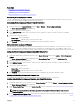
Selected Component Information
Information for the selected component is displayed in three independent sections:
• Health and Performance and Properties — Displays the active critical and non-critical events as shown by the hardware logs
and the performance data that vary with time.
• Properties — Displays the component properties that do not vary with time or change only infrequently.
• Quick Links — Provides links to navigate to the most frequently accessed pages, and also the most frequently performed
actions. Only links applicable to the selected component are displayed in this section.
64