
User manual
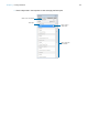
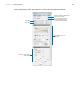
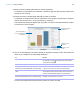
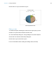
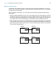
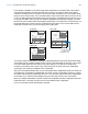
Table Of Contents
- Chapter 1 Introducing FileMaker Pro
- Chapter 2 Using databases
- About database fields and records
- Opening files
- Opening multiple windows per file
- Closing windows and files
- Saving files
- About modes
- Viewing records
- Adding and duplicating records
- Deleting records
- Entering data
- Working with data in Table View
- Finding records
- Performing quick finds in Browse mode
- Making find requests in Find mode
- Finding text and characters
- Finding numbers, dates, times, and timestamps
- Finding ranges of information
- Finding data in related fields
- Finding empty or non-empty fields
- Finding duplicate values
- Finding records that match multiple criteria
- Finding records except those matching criteria
- Viewing, repeating, or changing the last find
- Saving find requests
- Deleting and reverting requests
- Hiding records from a found set and viewing hidden records
- Finding and replacing data
- Sorting records
- Previewing and printing databases
- Automating tasks with scripts
- Backing up database files
- Setting preferences
- Chapter 3 Creating databases
- Planning a database
- Creating a FileMaker Pro file
- Creating and changing fields
- Setting options for fields
- Creating database tables
- Creating layouts and reports
- Working with layout themes
- Setting up a layout to print records in columns
- Working with objects on a layout
- Working with fields on a layout
- Working with layout parts
- Working with layout object, part, and background styles
- Creating and editing charts
- Chapter 4 Working with related tables and files
- Chapter 5 Sharing and exchanging data
- Sharing databases on a network
- Importing and exporting data
- Saving and sending data in other formats
- Sending email messages based on record data
- Supported import/export file formats
- Setting up recurring imports
- ODBC and JDBC
- Methods of importing data into an existing file
- About adding records
- About updating existing records
- About updating matching records
- About the importing process
- Converting a data file to a new FileMaker Pro file
- About the exporting process
- Working with external data sources
- Publishing databases on the web
- Chapter 6 Protecting databases
- Protecting databases with accounts and privilege sets
- Creating accounts and privilege sets
- Viewing extended privileges
- Authorizing access to files
- Security measures
- Enhancing physical security
- Enhancing operating system security
- Establishing network security
- Backing up databases and other important files
- Installing, running, and upgrading antivirus software
- Chapter 7 Converting databases from FileMaker Pro 11 and earlier
- Index

Chapter 3 | Creating databases 106
2. Sort the column containing data that you want to emphasize.
For example, to emphasize your customers’ companies, right-click the Company column and
choose Sort Ascending.
3. Choose the column containing the data that you want to compare.
For example, to compare the number of customers in each company, right-click the Last Name
column and choose Chart
> Chart Last Name by Company.
The Chart Setup dialog box appears with a preview of a column chart that shows the number
of customers in each company.
4. You can choose settings in the Chart inspector on the right to modify the chart, and preview the
result of your changes in the Chart Setup dialog box.
For more information about these and other options for charts, see Help.
To Do this
Add a title to the chart With the Chart options displayed, for Title, type or change
the chart title, or click
to specify a title. For example,
“Accounts by Company.”
Choose a chart type and specify the data series For Type, choose a chart type. For example, choose Pie.
Change data labels, show or hide tick marks and
set tick mark scale (if applicable), and format data
Select additional chart options. For example, select Show
Legend, Show values on chart, and Percentages.
Change the color scheme, legend, or fonts in the
chart
Click Styles, then make your changes. For example,
choose Shaded-3D for the chart style, Earth for the color
scheme, and Arial boldface black for the font settings.
Specify the type of data the chart uses (records in
the found set, delimited records, or related records)
Click Data Source, then choose a data source. For
example, choose Current Found Set.
Chart preview
Specify the chart type
and data series
Specify the records
to chart
The preview updates as
you change settings in the
Chart inspector
Change the chart’s
appearance