
User manual
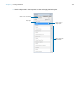
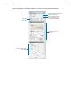
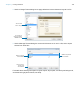
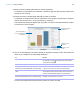
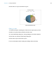
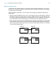
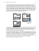
Table Of Contents
- Chapter 1 Introducing FileMaker Pro
- Chapter 2 Using databases
- About database fields and records
- Opening files
- Opening multiple windows per file
- Closing windows and files
- Saving files
- About modes
- Viewing records
- Adding and duplicating records
- Deleting records
- Entering data
- Working with data in Table View
- Finding records
- Performing quick finds in Browse mode
- Making find requests in Find mode
- Finding text and characters
- Finding numbers, dates, times, and timestamps
- Finding ranges of information
- Finding data in related fields
- Finding empty or non-empty fields
- Finding duplicate values
- Finding records that match multiple criteria
- Finding records except those matching criteria
- Viewing, repeating, or changing the last find
- Saving find requests
- Deleting and reverting requests
- Hiding records from a found set and viewing hidden records
- Finding and replacing data
- Sorting records
- Previewing and printing databases
- Automating tasks with scripts
- Backing up database files
- Setting preferences
- Chapter 3 Creating databases
- Planning a database
- Creating a FileMaker Pro file
- Creating and changing fields
- Setting options for fields
- Creating database tables
- Creating layouts and reports
- Working with layout themes
- Setting up a layout to print records in columns
- Working with objects on a layout
- Working with fields on a layout
- Working with layout parts
- Working with layout object, part, and background styles
- Creating and editing charts
- Chapter 4 Working with related tables and files
- Chapter 5 Sharing and exchanging data
- Sharing databases on a network
- Importing and exporting data
- Saving and sending data in other formats
- Sending email messages based on record data
- Supported import/export file formats
- Setting up recurring imports
- ODBC and JDBC
- Methods of importing data into an existing file
- About adding records
- About updating existing records
- About updating matching records
- About the importing process
- Converting a data file to a new FileMaker Pro file
- About the exporting process
- Working with external data sources
- Publishing databases on the web
- Chapter 6 Protecting databases
- Protecting databases with accounts and privilege sets
- Creating accounts and privilege sets
- Viewing extended privileges
- Authorizing access to files
- Security measures
- Enhancing physical security
- Enhancing operating system security
- Establishing network security
- Backing up databases and other important files
- Installing, running, and upgrading antivirus software
- Chapter 7 Converting databases from FileMaker Pro 11 and earlier
- Index

Chapter 3 | Creating databases 105
Creating and editing charts
You can create various types of charts in FileMaker Pro to compare data graphically. Before you
create a chart, think about the data comparison that you want to emphasize, then choose the
FileMaker
Pro chart type that will show the comparison clearly.
Creating a chart
The following steps describe how to create a quick chart, which FileMaker Pro sets up for you
based on the field(s) you’ve selected in Browse mode. When you create a quick chart,
FileMaker
Pro sets up the chart based on the selected fields, field type, the contents of the active
field, and the sort order you specified.
Note You can also create charts in Layout mode. For more information about creating charts in
Layout mode, see Help.
The following example describes how to create a chart that counts and compares the number of
customers in each company that has an account with your business.
1. Open the file in which you want to add the chart, then switch to Table View.
Use To
Column chart (vertical)
or bar chart (horizontal)
Compare increases to decreases, highest with lowest, how many, or how often. For
example, show monthly sales for several products.
Stacked column chart
(vertical) or stacked bar
chart (horizontal)
Compare parts to the whole. For example, compare annual sales figures over several
years.
Positive/negative
column chart
Compare positive and negative values. For example, compare earnings to losses.
Pie chart Compare percentages of individual parts within the whole. For example, show the
percentage of each product sold within total sales.
Line chart Show data that changes continuously over time, such as historical financial data.
Area chart Compare data that trends over time while emphasizing highs, lows, and movement
between data points. For example, show sales totals or averages.
Scatter chart Plot x and y coordinates as individual values to reveal correlation patterns. For example,
compare target wait time to actual wait time at a call center.
Bubble chart Compare individual data points in terms of size. For example, compare market share by
charting the number of products sold, sales figures per product, and percentage of total
sales in each data point.