
Tutorial
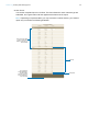
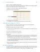
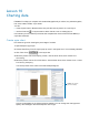

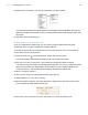
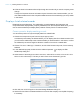
Table Of Contents
- Lesson 1 FileMaker Pro basics
- Lesson 2 Browsing information
- Lesson 3 Finding and sorting records
- Use quick find to search a database
- Find records based on criteria in a single field
- Find records based on criteria in specific separate fields
- Find records that match multiple criteria in the same field
- Find records that match a range of criteria in the same field
- Narrow your search
- Save a find request to use later
- Find records using a saved find
- Sort your found set
- Add a new record in List View
- For more information
- Lesson 4 Creating a database and entering records
- Lesson 5 Customizing what you see
- Lesson 6 Creating lists, mailing labels, and form letters
- Lesson 7 Simplifying data entry
- Lesson 8 Automating tasks with buttons and scripts
- Lesson 9 Creating and running reports
- Lesson 10 Charting data
- Lesson 11 Making databases relational
- Lesson 12 Sharing and exchanging data
- Lesson 13 Protecting data in FileMaker Pro
- Lesson 14 Backing up your databases

Lesson 10
Charting data
FileMaker Pro helps you compare and contrast data graphically in column, bar, positive/negative,
line, area, scatter, bubble, or pie charts.
You can:
1 create a quick chart in Browse mode, then print the chart or place it on a new layout
1 use the Chart tool in Layout mode to add a chart to a new or existing layout
In this lesson you will create a quick chart that compares fee revenue from Favorite Bakery’s
corporate customers.
Create a pie chart
Pie charts are good for showing the percentage of a whole.
1. Open Sample Copy.fmp12.
2. Choose Data Entry from the Layout pop-up menu in the layout bar, if it’s not already selected.
3. Click Table View in the layout bar.
4. Move the pointer over the Company column, click the down arrow, then choose Sort
Ascending.
5. Move the pointer over the Fee Paid column, click the down arrow, then choose Chart > Chart
Fee Paid by Company.
You see a preview of the chart in the Chart Setup dialog box.
Column charts display in the Chart preview by default. You can change the chart type and
specify other settings in the Chart inspector on the right.
FileMaker Pro specifies
quick chart settings