
User Guide


Quality Management Desktop User Guide
26 September 2009
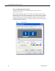
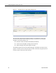
The upper half of the dashboard displays statistics in graphical form, either a bar
chart (for the Evaluation Totals and Contact Totals) or a line chart (for the Quality
Averages). The charted statistics are:
■ Evaluation Totals (Total Exceed/Total Meet/Total Below)
■ Contact Totals (total QM recordings/total evaluations)
■ Quality Averages (Group/Team/Agent averages)
The default graph for all roles is the Quality Averages. The default time frame for this
graph is 4 months (current month plus past 3 months). Otherwise, the graphs span 12
months (current month plus 11 past months).
Figure 12. Dashboard tab for an agent, Quality Averages chart