
User Manual
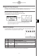
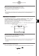
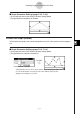
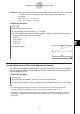
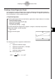
Table Of Contents
- Getting Ready
- Contents
- About This User’s Guide
- Chapter 1 Getting Acquainted
- Chapter 2 Using the Main Application
- 2-1 Main Application Overview
- 2-2 Basic Calculations
- 2-3 Using the Calculation History
- 2-4 Function Calculations
- 2-5 List Calculations
- 2-6 Matrix and Vector Calculations
- 2-7 Using the Action Menu
- 2-8 Using the Interactive Menu
- 2-9 Using the Main Application in Combination with Other Applications
- 2-10 Using Verify
- Chapter 3 Using the Graph & Table Application
- Chapter 4 Using the Conics Application
- Chapter 5 Using the 3D Graph Application
- Chapter 6 Using the Sequence Application
- Chapter 7 Using the Statistics Application
- 7-1 Statistics Application Overview
- 7-2 Using List Editor
- 7-3 Before Trying to Draw a Statistical Graph
- 7-4 Graphing Single-Variable Statistical Data
- 7-5 Graphing Paired-Variable Statistical Data
- 7-6 Using the Statistical Graph Window Toolbar
- 7-7 Performing Statistical Calculations
- 7-8 Test, Confidence Interval, and Distribution Calculations
- 7-9 Tests
- 7-10 Confidence Intervals
- 7-11 Distribution
- 7-12 Statistical System Variables
- Chapter 8 Using the Geometry Application
- Chapter 9 Using the Numeric Solver Application
- Chapter 10 Using the eActivity Application
- Chapter 11 Using the Presentation Application
- Chapter 12 Using the Program Application
- Chapter 13 Using the Spreadsheet Application
- Chapter 14 Using the Setup Menu
- Chapter 15 Configuring System Settings
- 15-1 System Setting Overview
- 15-2 Managing Memory Usage
- 15-3 Using the Reset Dialog Box
- 15-4 Initializing Your ClassPad
- 15-5 Adjusting Display Contrast
- 15-6 Configuring Power Properties
- 15-7 Specifying the Display Language
- 15-8 Specifying the Font Set
- 15-9 Specifying the Alphabetic Keyboard Arrangement
- 15-10 Optimizing “Flash ROM”
- 15-11 Specifying the Ending Screen Image
- 15-12 Adjusting Touch Panel Alignment
- 15-13 Viewing Version Information
- Chapter 16 Performing Data Communication
- Appendix

20050501
7-5 Graphing Paired-Variable Statistical Data
With paired-variable statistical data there are two values for each data item. An example of
paired-variable statistical data would be the change in size of an iron bar as its temperature
changes. One variable would be temperature, and the other variable is the corresponding
bar size. Your ClassPad lets you produce any of the graphs described in this section using
paired-variable data.
Before trying to draw any of the graphs described below, configure the graph setup using the
procedures under “Configuring StatGraph Setups” on page 7-3-2.
Drawing a Scatter Plot and xy Line Graph
Use the procedure below to plot a scatter diagram and then connect the dots to produce an
xy line graph.
Example: Input the paired-variable data shown below. Next, plot the data on a scatter
diagram and then connect the dots to produce an xy line graph.
list1 = 0.5, 1.2, 2.4, 4.0, 5.2
list2 = –2.1, 0.3, 1.5, 2.0, 2.4
u ClassPad Operation
(1) m I
(2) Input the data shown above.
(3) Tap [SetGraph] and then [Setting…], or tap G.
(4) On the Set StatGraphs dialog box that appears, configure a StatGraph setup with the
scatter plot settings shown below, and then tap [Set].
Draw: On
Type: Scatter
XList: list1
YList: list2
(5) Tap y to plot the scatter plot.
(6) Tap the List window to make it active.
(7) Tap [SetGraph] and then [Setting…], or tap G.
(8) On the Set StatGraphs dialog box that appears, configure a StatGraph setup with the
xy line graph settings shown below, and then tap [Set].
Draw: On
Type: xyLine
XList: list1
YList: list2
7-5-1
Graphing Paired-Variable Statistical Data