
User's Guide Part 2


User Guide: PTP 600 Series Configuring the PTP 600
phn-0896_009v003
Feb 2010
UNDER DEVELOPMENT
6-29
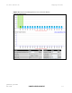
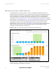
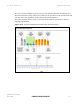
The X-axis shows a stylized view of the 9 or 10 selectable wireless channels. It is
important to note that adjacent channels on the display have a 10 MHz overlap. The
display separates the display of channels to help the clarity of the resultant display.
The axis is labeled using the channel center frequencies in MHz.
The Y-axis shows the interference power levels from –100 to –40 dBm.
The active channel (channel 5 in Figure 6-11) i
s always marked using hatched green
and white lines. The width of the hatching is directly proportional the channel
bandwidth spectral occupancy of the channel.
The individual channel metrics are displayed using a colored bar and an ‘I’ bar.
The colored bar represents the following channel state:
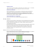
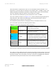
Table 6-1 Spectrum management change state key
Green Active
The channel is currently in use, hosting the
Point-to-Point wireless link
Orange Interference
The channel has interference above the
interference threshold
Blue Available
The channel has an interference level below
the interference threshold and is considered by
the Spectrum Management algorithm suitable
for hosting the Point-to-Point link
Grey Barred
The system administrator has barred this
channel from use. For improved visibility, an
additional red ‘lock’ symbol is used to indicate
that a channel is barred.
The top of the colored bar represents the 99.9% percentile metric for specific channel.
The ‘I’ Bar is used to display the mean of means and peak of means metrics. The lower
horizontal bar represents the mean of means and the upper horizontal bar represents
the peak of means. The vertical bar is used as a visual cue to highlight the statistical
spread between the peak and the mean of the statistical distribution.