
Software Updates User guide

Gene Expression Analysis
118
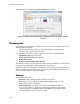
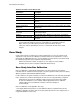
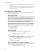
Figure 85 shows the samples with the Show Chart option selected.
Figure 85. Samples tab in the Experiment Settings window with Analysis Settings
selected.
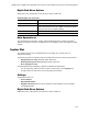
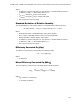
Clustergram
A clustergram shows the data in a hierarchy based on the degree of similarity of expression for
different targets and samples.
NOTE: A reference target needs to be selected to display any of the data plots
other than relative expression for bar charts.
The clustergram image depicts relative expression of a sample or target as follows:
• Upregulation (red). Higher expression
• Downregulation (green). Lower expression
• No regulation (black)
• No value calculated (black with a white X)
The lighter the shade of color, the greater the relative expression difference. If no normalized
Cq value can be calclulated, the square will be black with a white X.
On the outer edges of the data plot is a dendrogram, which indicates the clustering hierarchy.
Targets or samples that have similar expression patterns will have adjacent branches while
those with dissimilar patterns will be more distant.
Settings
The following can be set:
• Cluster By. Targets, Samples, Both, or None can be selected
• Size. Image size can be adjusted using the slider to alter the degree of chart
magnification for easier visualization
• Split Out Replicates. This option shows values for the individual replicates
TIP: The color scheme for clustergram, scatter plot, volcano plot, and heat map
can be changed from the default Red/Green to Red/Blue by selecting this option
from the right-click menu on any of these charts.