
Software Updates Instruction Manual
Gene Expression Analysis
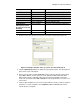
100
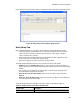
• Downregulation (green circle). Relatively lower expression
• No change (black circle)
Click and drag either vertical threshold line to adjust the regulation threshold value.
Settings
The following can be set:
• Control sample
• Experimental sample
• Regulation or P-Value threshold. Enter or adjust the value using arrows and the
plot threshold lines will be moved appropriately
Right-Click Menu Options
Right-click on the volcano plot to select the items shown in Table 39.
Data Spreadsheet
The spreadsheet lists the target, sample, regulation, p-value, whether the p-value exceeds the
threshold, and indicates up- or downregulation compared to the threshold setting. Click the
check box adjacent to a target to include or exclude it from the plot. Select chart options by
right-clicking.
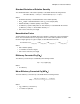
Heat Map
The heat map presents a visual depiction of the regulation of targets for an experimental
sample compared to a control sample based on relative normalized expression and its location
on a plate.
A legend below the heat map shows the range of normalized expression, which corresponds
to the following:
• Upregulation (red). Relatively higher expression
• Downregulation (green). Relatively lower expression
• No change (black)
The lighter the shade of color, the greater the relative normalized expression difference. If no
normalized expression value can be calclulated the square will be black with a white X.
Settings
The following can be set:
• Control sample
• Experimental sample
• Size. Image size can be adjusted using the slider to alter the degree of chart
magnification for easier visualization
• Split out replicates. Show values for the individual replicates
Right-Click Menu Options