
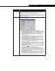
Specifications
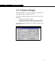


Extension View Editor 4-43
4-43
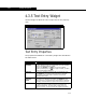
Word Wrap Available only when the Multi-Line checkbox is selected.
Select this checkbox if you would like the widget to start a
new line of text when the width of the widget has been
reached. If this checkbox is cleared, you must use the
ENTER key to proceed to the next line.
Update Each
Character
When this checkbox is selected, an update (Viewable
methods SpecifyText and TextValue called) is performed
after each character is entered. This is used in the Match
cell for component selection, Components tab of the Fluid
Package property view.
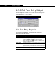
Allow
Viewing Only
When this checkbox is selected, the text entry widget is
read-only.
Push Default
Button
When this checkbox is selected, pressing the ENTER key
sends the message for the DefaultView form’s default
button. This is a convenience feature that allows the user to
enter a text string, press ENTER and have the DefaultView
form react as though the default button had also been
pressed. It is rarely used, but can be used to have the
DefaultView form accept the text input and close the
DefaultView form at the same time. The default button is
specified in the DefaultView form properties.
Mono Space
Font
Select this checkbox to have characters line up perfectly in
the vertical direction when using the Multi-Line
functionality.
This is equivalent to selecting Mono Space as a font in the
Session Preferences (Tools-Preferences).
Target
Widget
By making a selection from this drop-down list, you are
instructing the text entry widget to receive its information
from the Target Widget. When a target widget is selected,
the target moniker must correspond to a variable
associated with the target widget.
For example, you could select an attachment list (i.e., a list
of product streams) as the target widget and have the
selected item in the list, an object, appear in the text entry
widget. You would then have to link the Target Moniker to
the object variable type associated with the attachment list.
Object Description