
User's Manual
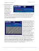

FutureWaves™ User Manual
FutureWaves™ v1.7.0.1
21
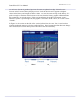
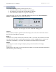
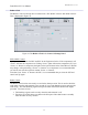
As each new forecast is produced, previous forecasts are plotted ‘on edge’ below the new
forecast in the Forecast History display section. Peaks in the time series appear as brighter
values in the history and troughs as darker values. As new forecasts stack up in the history, if a
peak or trough is consistent from forecast-to-forecast, then the history graphic will demonstrate
this consistency as vertical stripes. If they are inconsistent, the graphic will appear ‘spotty’.
When the system is performing well, this graphic is referred to as the ‘zebra’, if it is not it is the
‘cheetah’.
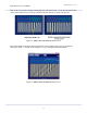
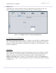
In Figure 21, the section on the left of the vertical yellow-line, the ‘now’ line, is used to show
what the measured motion was for the prediction times. Since measured motion does not change
once measured, this section always has a zebra above the forecast history.
Figure 21:
Micro-Forecast Panel
Example Part 3
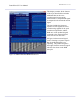
Present
Future
Past